Building digital products and interfaces that people actually want to use — for over 25 years.
Three deep-dives into product problems, the design process, and measurable outcomes.
A systems-driven redesign of Healthgrades' primary traffic and conversion driver, improving clarity, SEO performance, and scalability across the platform.
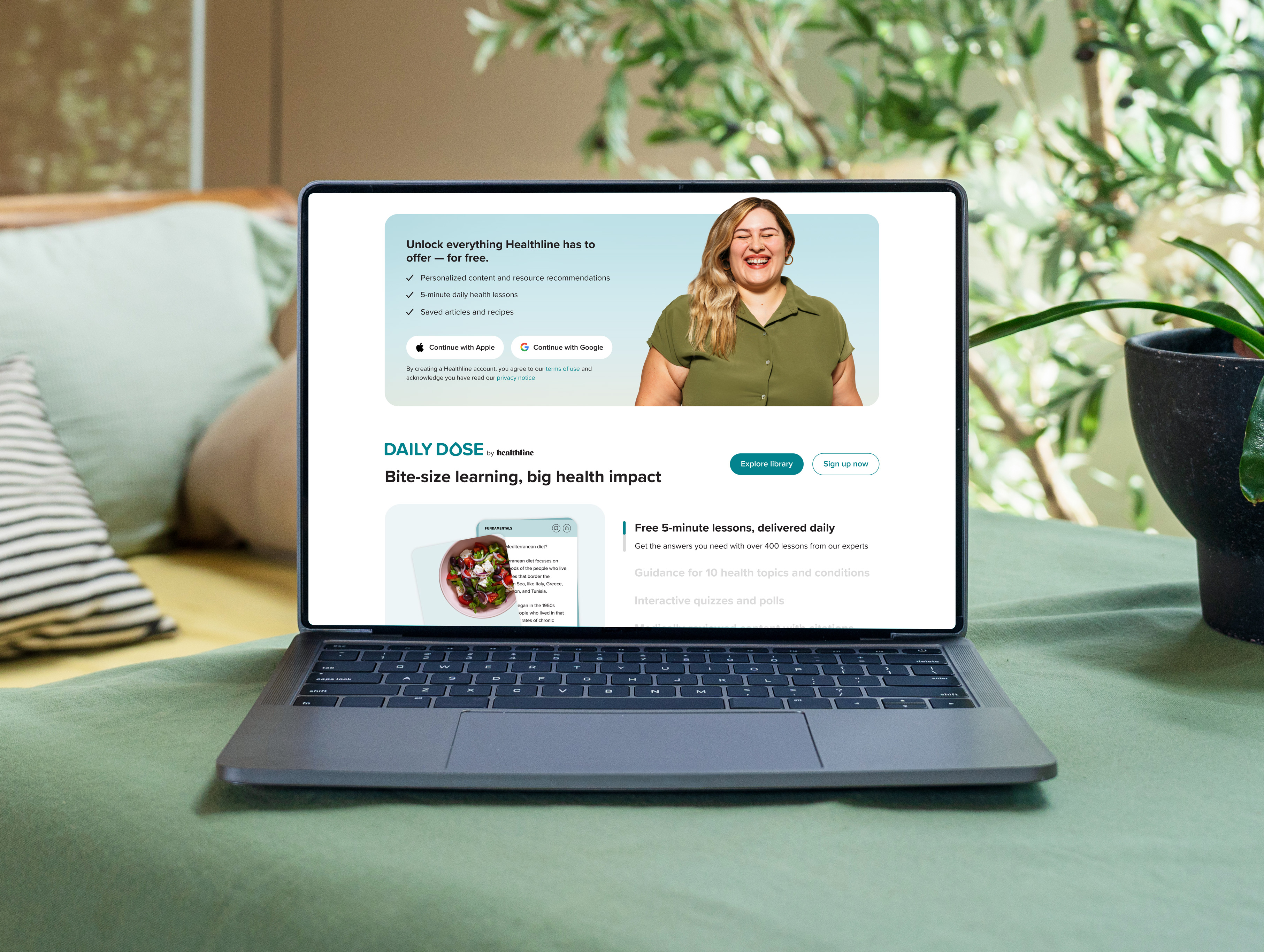
Evolving a high-traffic health platform beyond content consumption — through interactive quizzes, personalization tools, editorial reviews, and decision-support features that deepened engagement and partner value.
A multi-channel campaign celebrating BP's US Olympic and Paralympic sponsorship, spanning broadcast, digital activations, and an interactive iPad experience connecting commitments to human stories.
A selection of projects spanning over two decades of digital product and interface design.
With over 25 years in digital product and interface design, I've helped startups find their footing and enterprises rethink what their products can be. I care about systems thinking, interaction quality, and shipping things that actually work for real people.
Based in the Charlotte, NC area. Open to select collaborations.
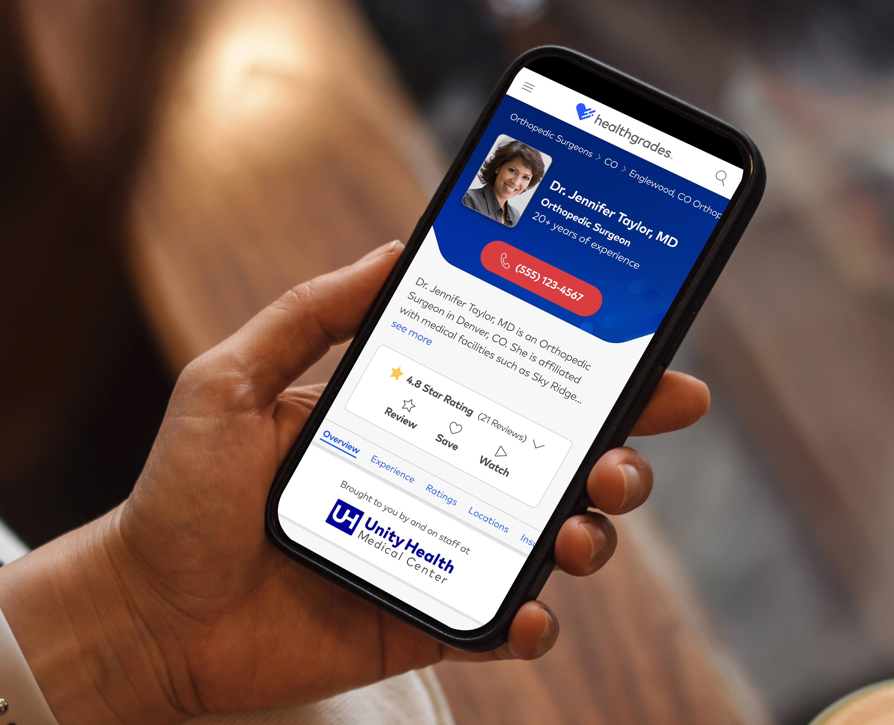
Provider Profile Redesign — a modular, systems-driven overhaul of the platform's primary traffic and conversion driver.
Healthgrades' Provider Profiles are the platform's primary traffic and conversion driver — the pages millions of patients land on when searching for a doctor. Over the years, the experience had become fragmented: incremental updates, legacy code, and shifting business priorities had left the profiles inconsistent, hard to maintain, and underperforming both for users and in search.
The goal was to redesign the experience to improve clarity, scalability, and performance while enabling faster iteration across teams.
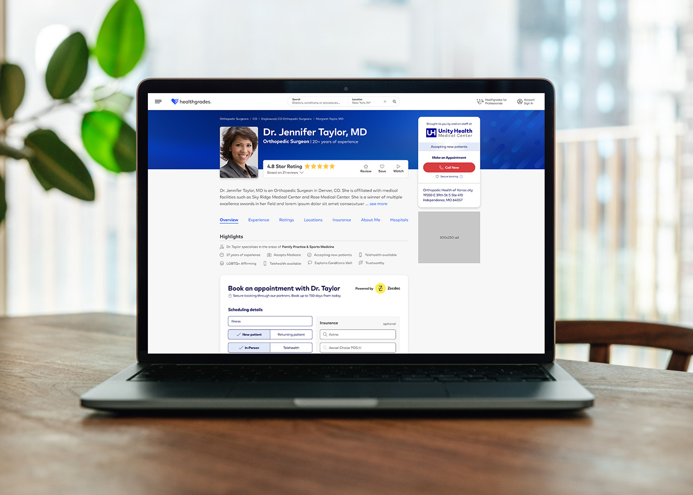
Healthgrades Provider Profile
Users struggled to interpret critical decision-making signals — provider expertise, outcomes, and reviews were buried or unclear, leading to higher bounce rates and lower conversion. Patients couldn't quickly answer the questions that mattered most: Is this doctor right for me? Can I get an appointment?
Internally, the problem was equally acute. Legacy architecture and an under-governed design system made even small updates slow and costly, limiting experimentation and consistency across the site. Teams worked around each other rather than with each other.
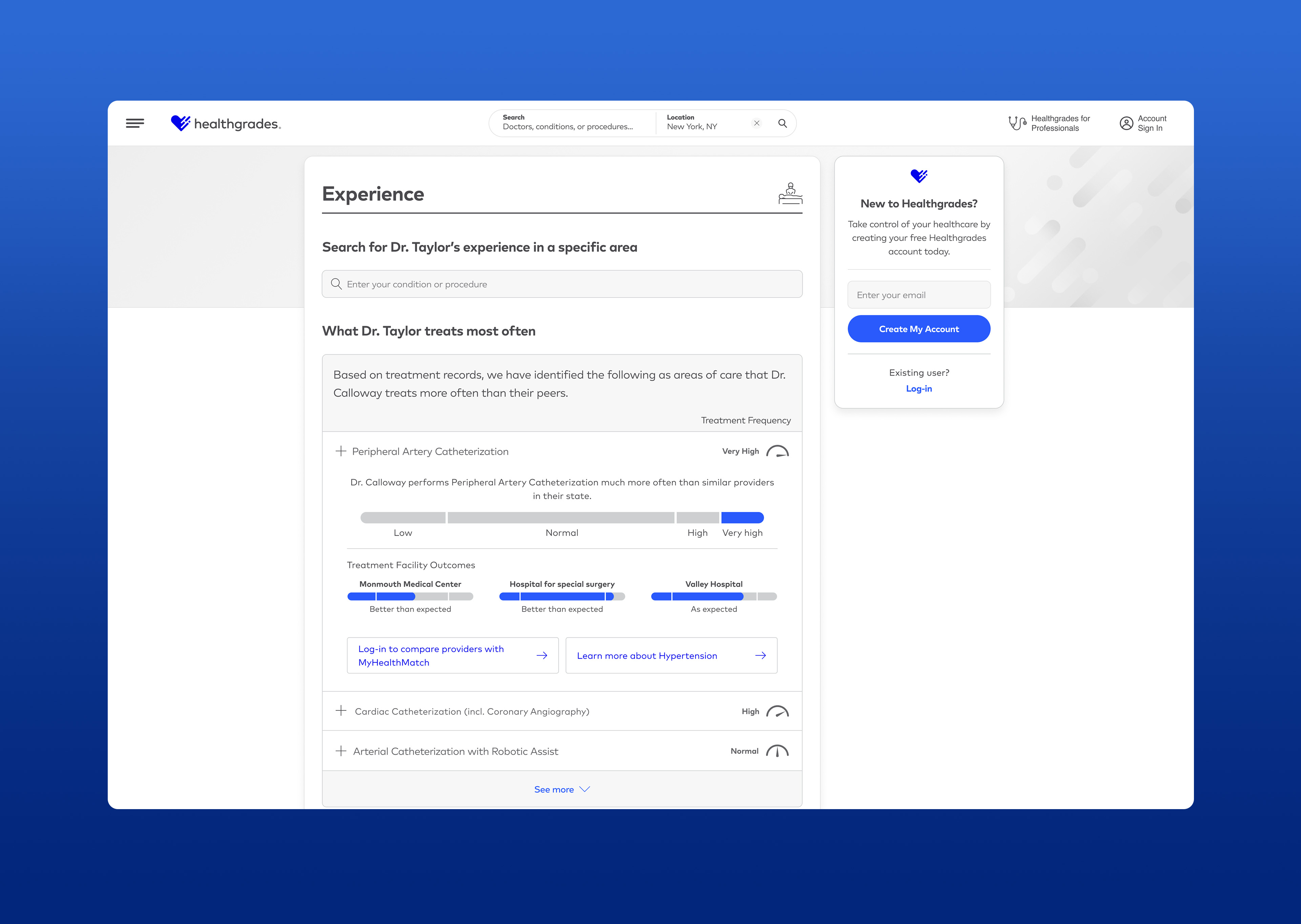
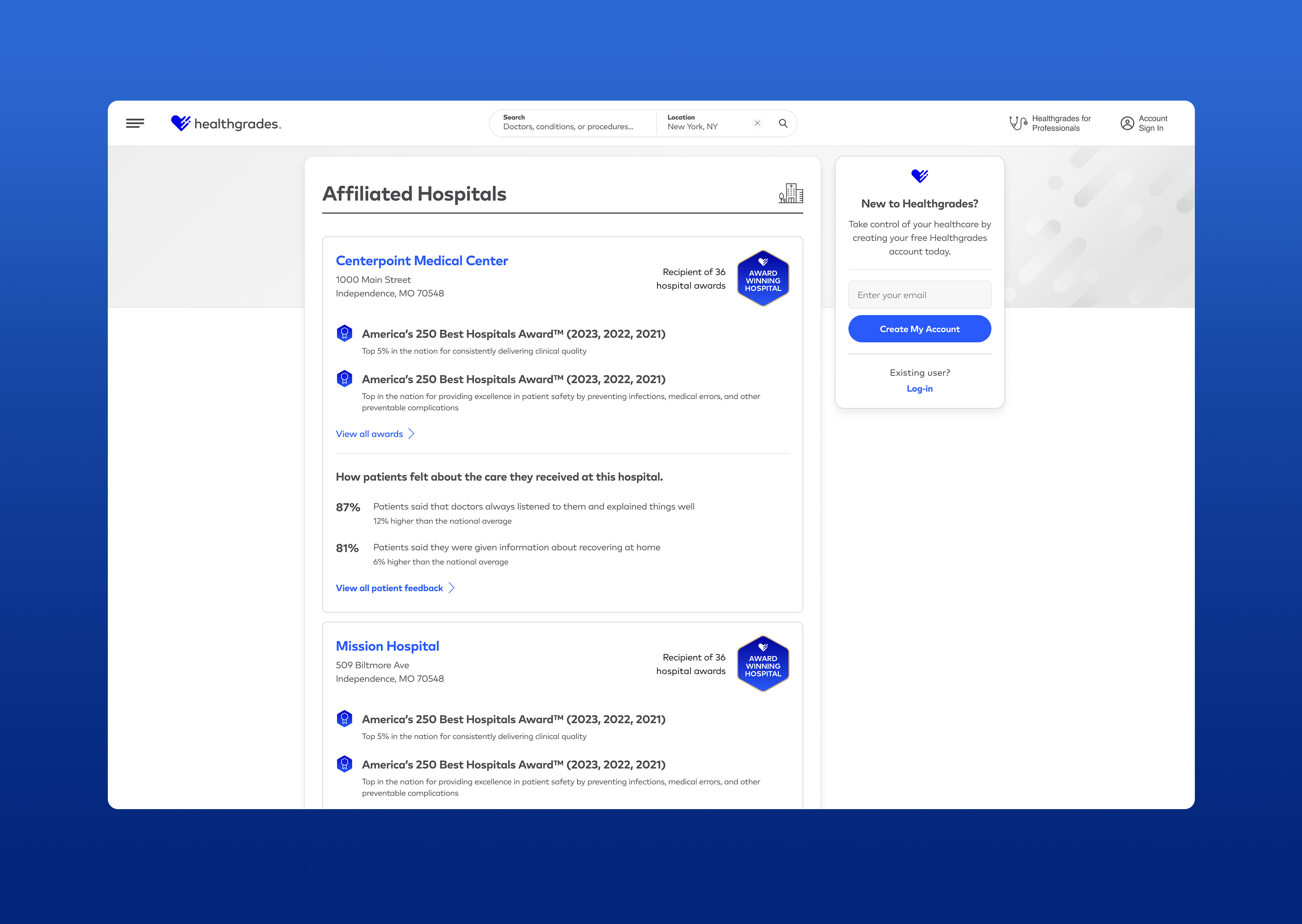
Provider profile sections showing Experience data and Affiliated Hospitals — key areas where information hierarchy and data clarity were redesigned.
I led a systems-driven redesign that introduced the Modular Profile framework — prioritizing clear information hierarchy, component modularity, and usability over cosmetic refreshes. The approach centered on making profiles easier to understand, easier to maintain, and easier to improve over time.
Key contributions included:
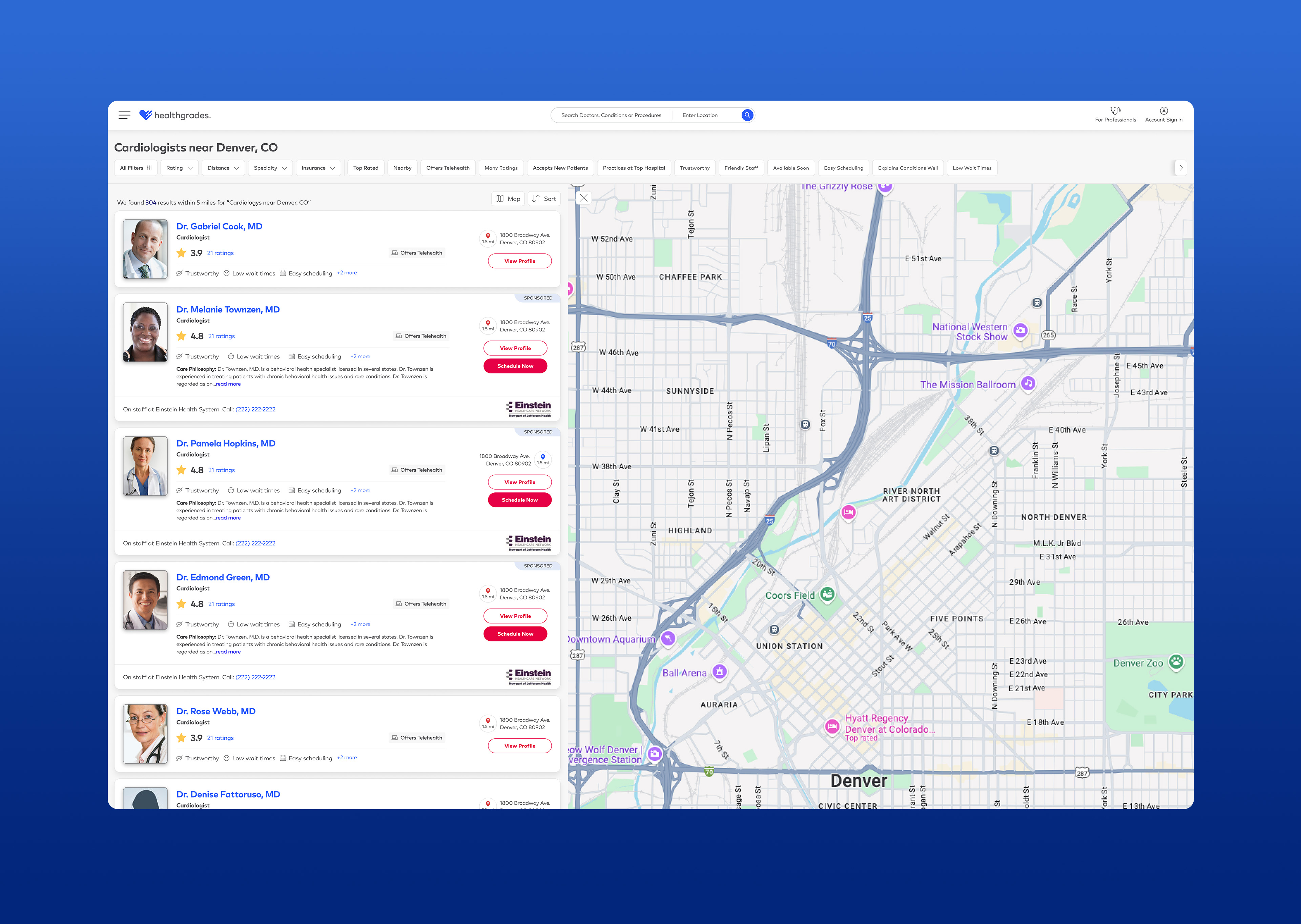
A fully responsive redesign of the search results experience, rebuilding provider cards with a clearer hierarchy of information, stronger engagement points, and a redesigned map search that made it easier to find and compare providers by location.
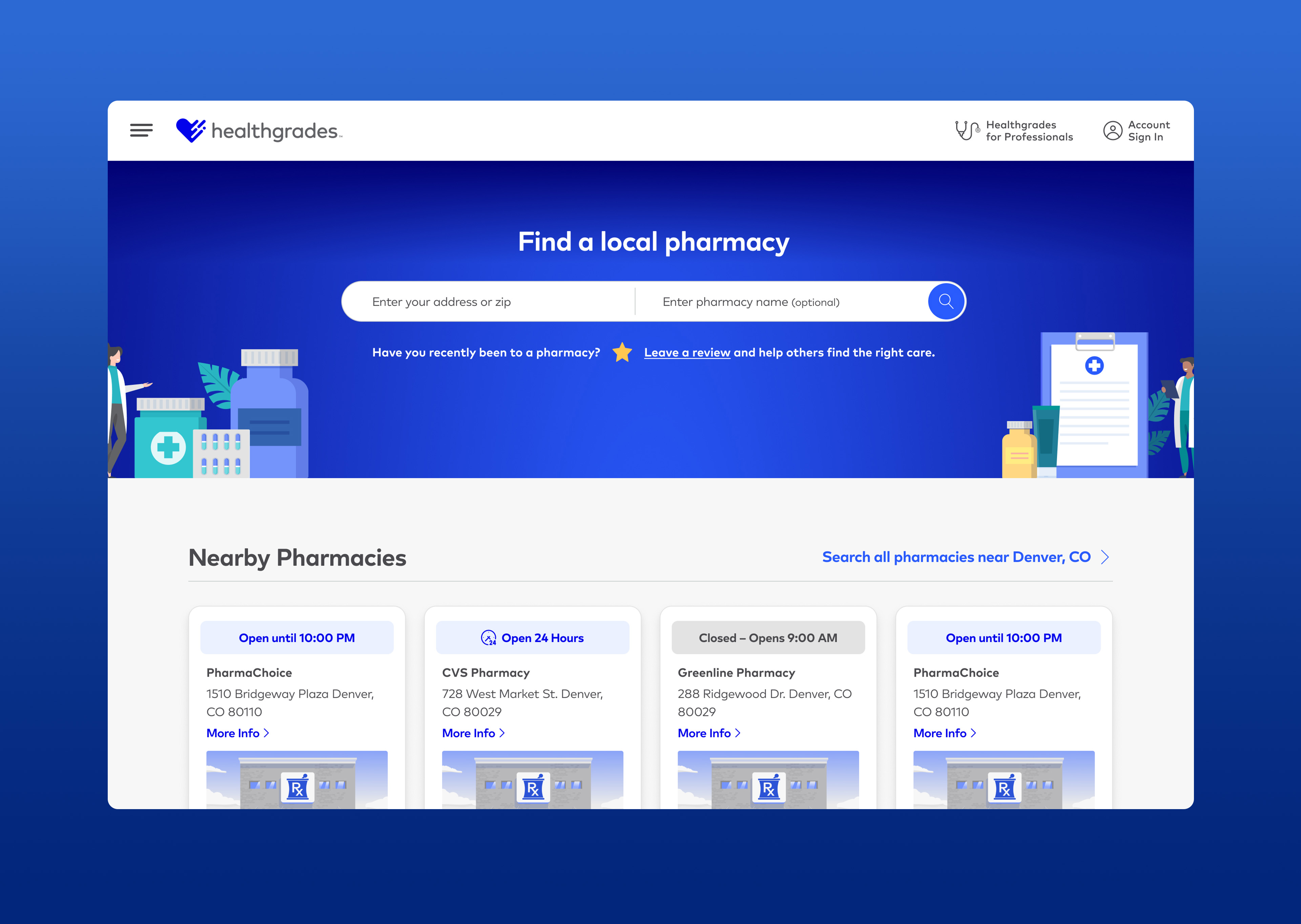
Updated facility pages extended the Modular Profile framework to pharmacy listings — surfacing clearer pharmacy information, refined card designs, and a stronger hierarchy of content, all while maintaining brand continuity with the rest of the platform.
Following the December 2025 Google Core Algorithm Update, the redesigned profiles delivered measurable platform-wide results: 31% increase in overall performance, 31% increase in sitewide calls, 15% increase in calls for HCA, 25% increase in provider reviews, and a 6% lift in user trust metrics.
Following the success of Provider Profiles, the same UI/UX standards and modular components were scaled across search, facility profiles, and pharmacy experiences — driving greater consistency, faster delivery, and broader platform impact.
Engagement & Trust Feature Expansion — evolving a content platform toward interactive decision-support and deeper user engagement.
Healthline's business model historically relied on organic search visibility and ad-based monetization. As algorithm volatility increased, the product needed to evolve beyond traffic acquisition toward deeper engagement, trust-building, and meaningful decision support. This shift required expanding the platform with interactive and editorial features that helped users evaluate options, discover personalized solutions, and connect with trusted partner offerings.
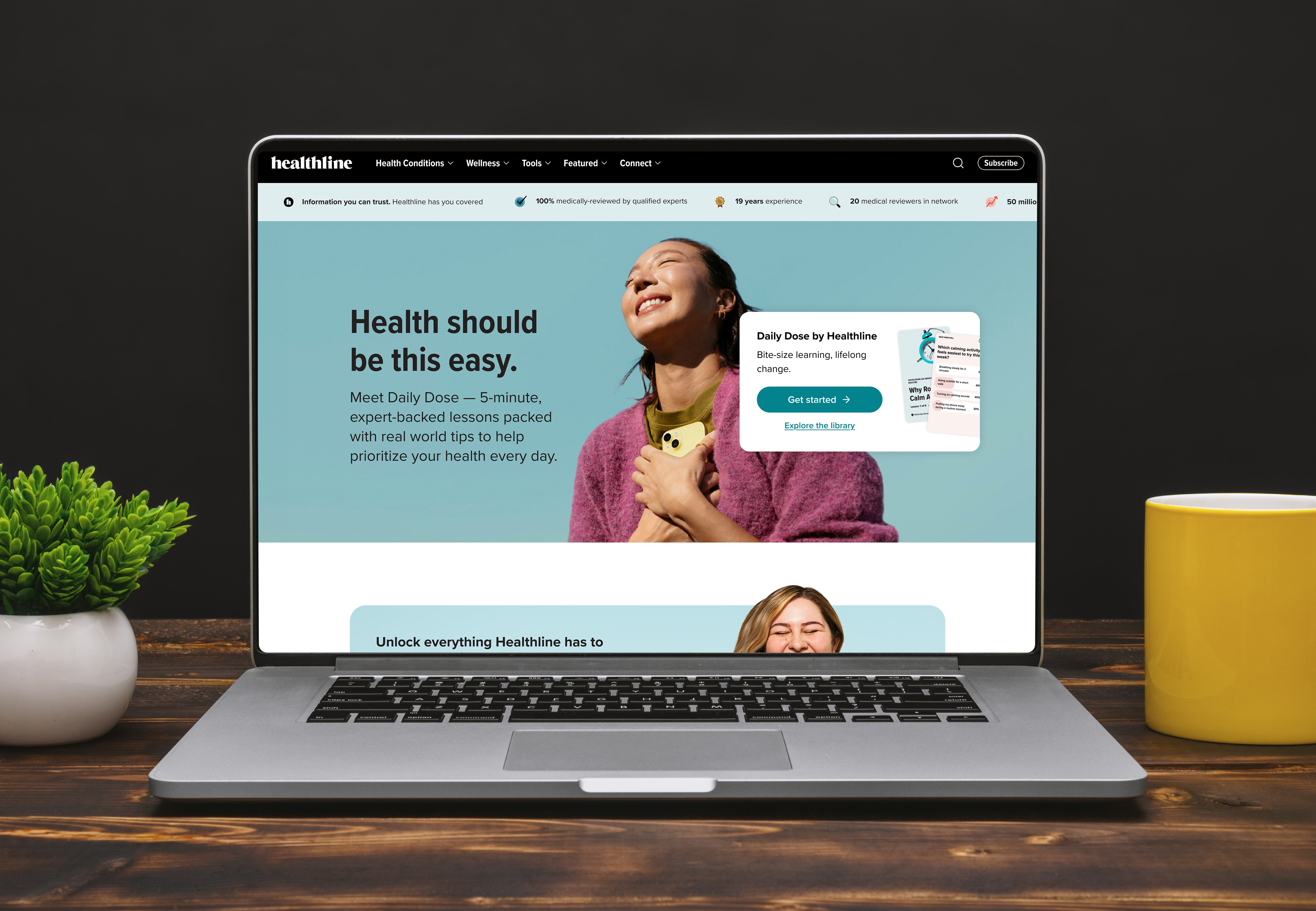
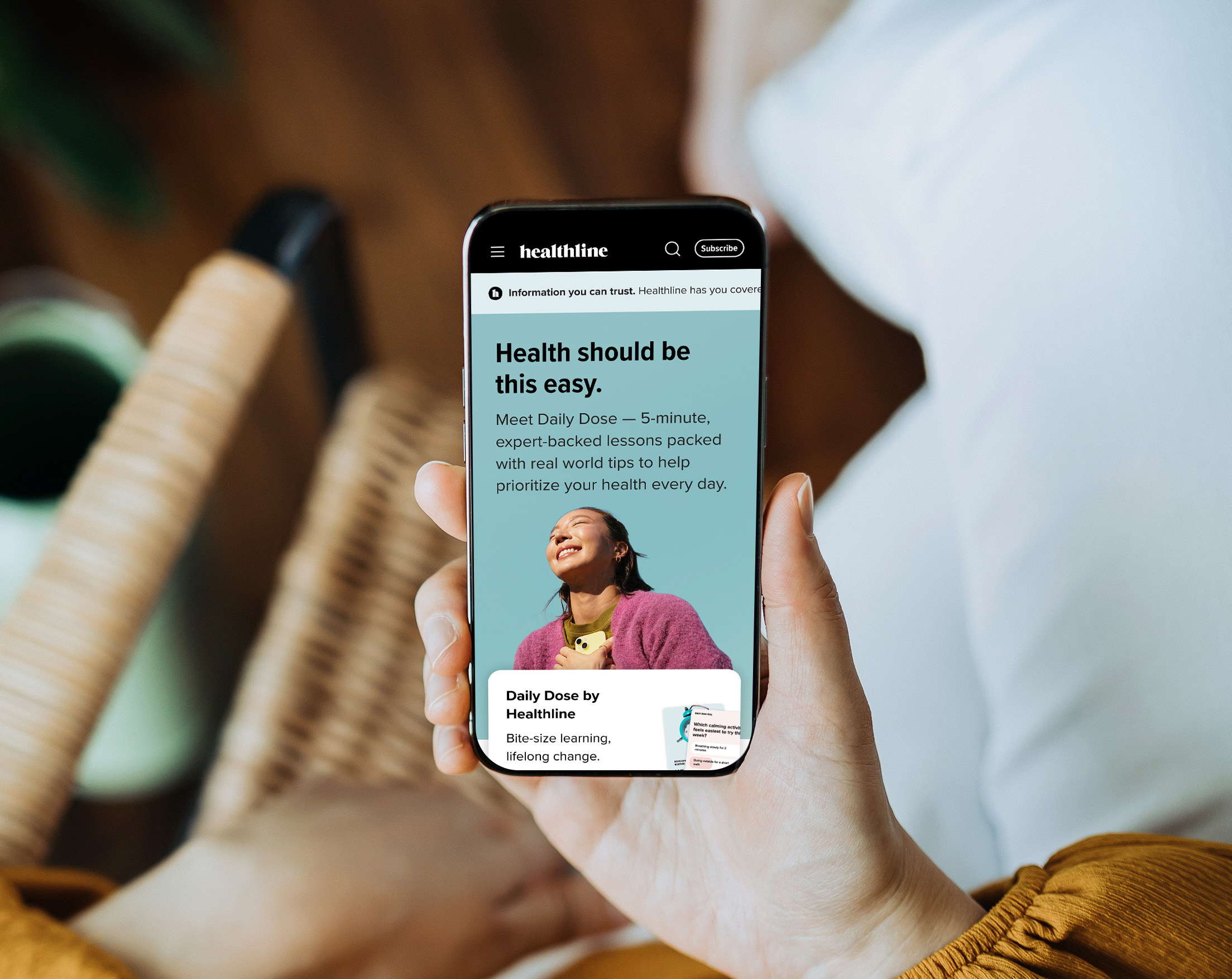
Healthline homepage — the platform's primary entry point for health content and product discovery.
While Healthline's information architecture excelled at scale and discoverability, the experience provided limited interactive guidance for users navigating complex health and wellness decisions. Static content lacked tools for comparison or personalization, and partner value was constrained by minimal differentiation pathways. Users needed clearer ways to explore solutions, build confidence in choices, and find relevant next steps — whether related to nutrition, mental health, or product selection.
At the same time, sustaining engagement required more than informational authority. The platform needed trusted editorial depth, interactive exploration, and personalized pathways that aligned user intent with partner ecosystems without compromising credibility.
Healthline mobile experience — where the majority of users engage with health content.
The strategy focused on expanding the product experience through feature-driven engagement and trust-building initiatives:
Across initiatives, UX simplification, transparency, and attribution clarity were strengthened to reinforce trust signals and ensure editorial integrity remained central to the experience.
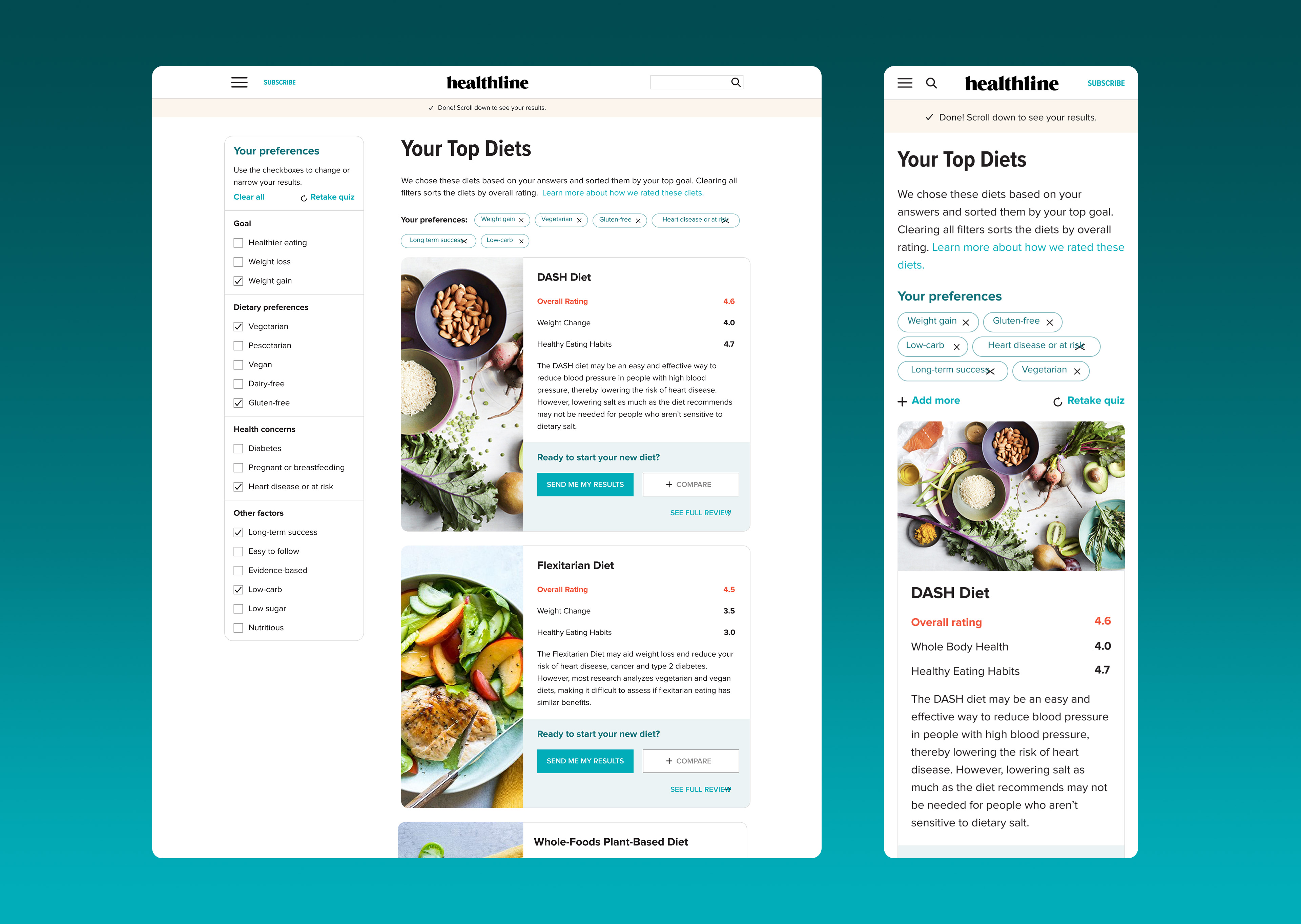
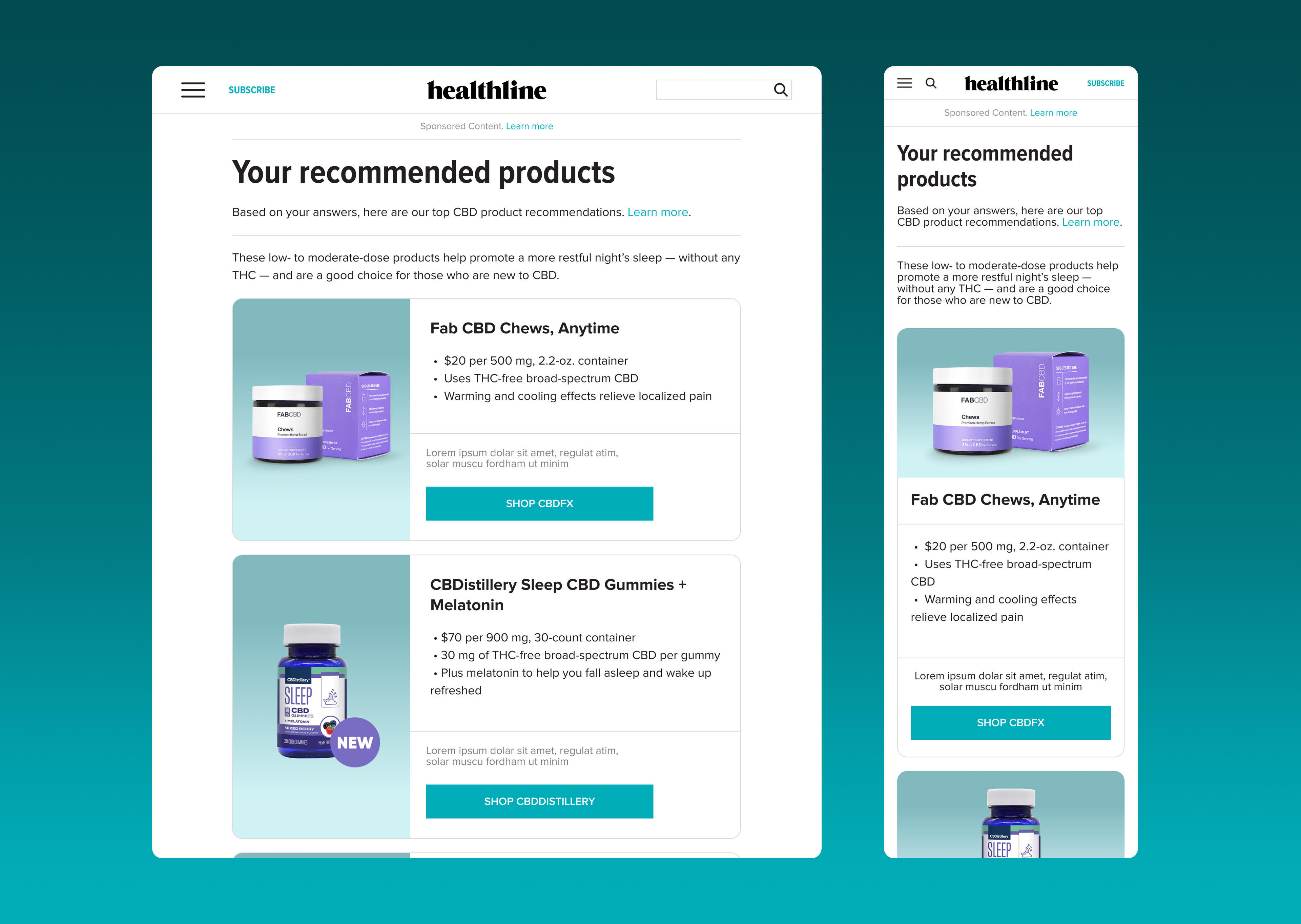
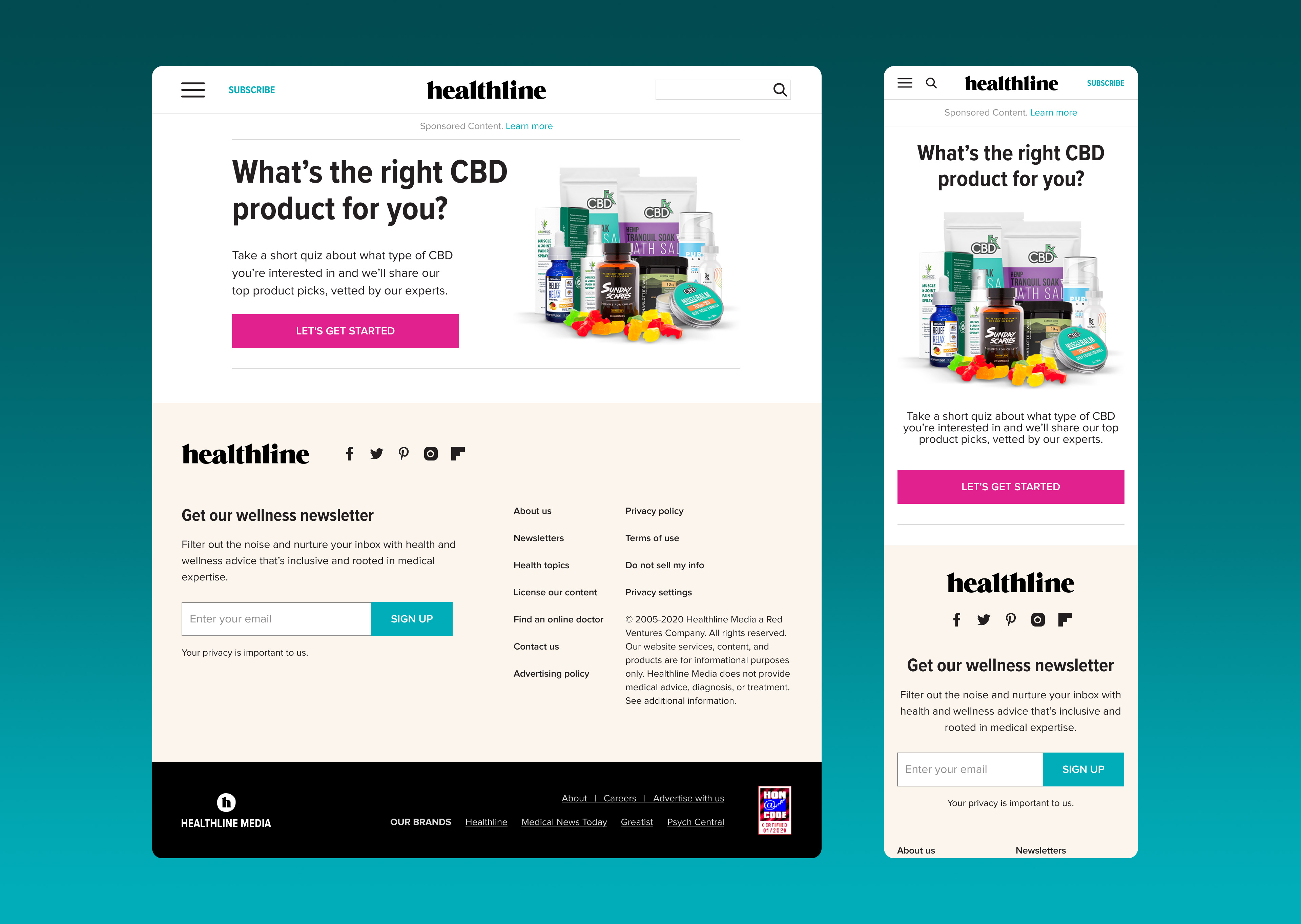
Diet Finder personalization tool, recommended products experience, and CBD product quiz — three of the feature expansions that deepened user engagement and partner value.
These feature additions repositioned Healthline from a primarily content-consumption destination to a more interactive decision-support ecosystem. Engagement quality improved through deeper participation, stronger trust signals, and increased exploration of personalized pathways. The platform diversified how users discovered value — through reviews, tools, and guided journeys — while creating more meaningful and credible connections between user intent and partner engagement.
Team USA Campaign & Interactive Platform — an online vision built to promote Olympic and Paralympic athletes, tell their stories, and showcase BP's support for their journey to the Games.
Following the Deepwater Horizon oil spill in 2010, BP faced a significant brand and trust crisis. As part of its recovery efforts, the company was named a sustainability partner of the 2012 London Olympic and Paralympic Games — an opportunity to invest in green initiatives and begin repairing its public image. BP's involvement included supporting UK and US Olympians and Paralympians, fueling 5,000 official Games vehicles, and running "Target Neutral," its carbon-offsetting program.
To help promote this sponsorship, Ogilvy Interactive was commissioned to build an online platform that would put athletes — not the brand — front and center: promoting their journeys, sharing their stories, and demonstrating BP's support for Team USA in an authentic, human way.
Our team designed and built an interactive site combining video and emerging technology, including some of the earliest applications of augmented reality in a branded sports campaign. Each athlete's story was told through short-form video content, giving them the platform to speak directly to their journey rather than having BP speak for them.
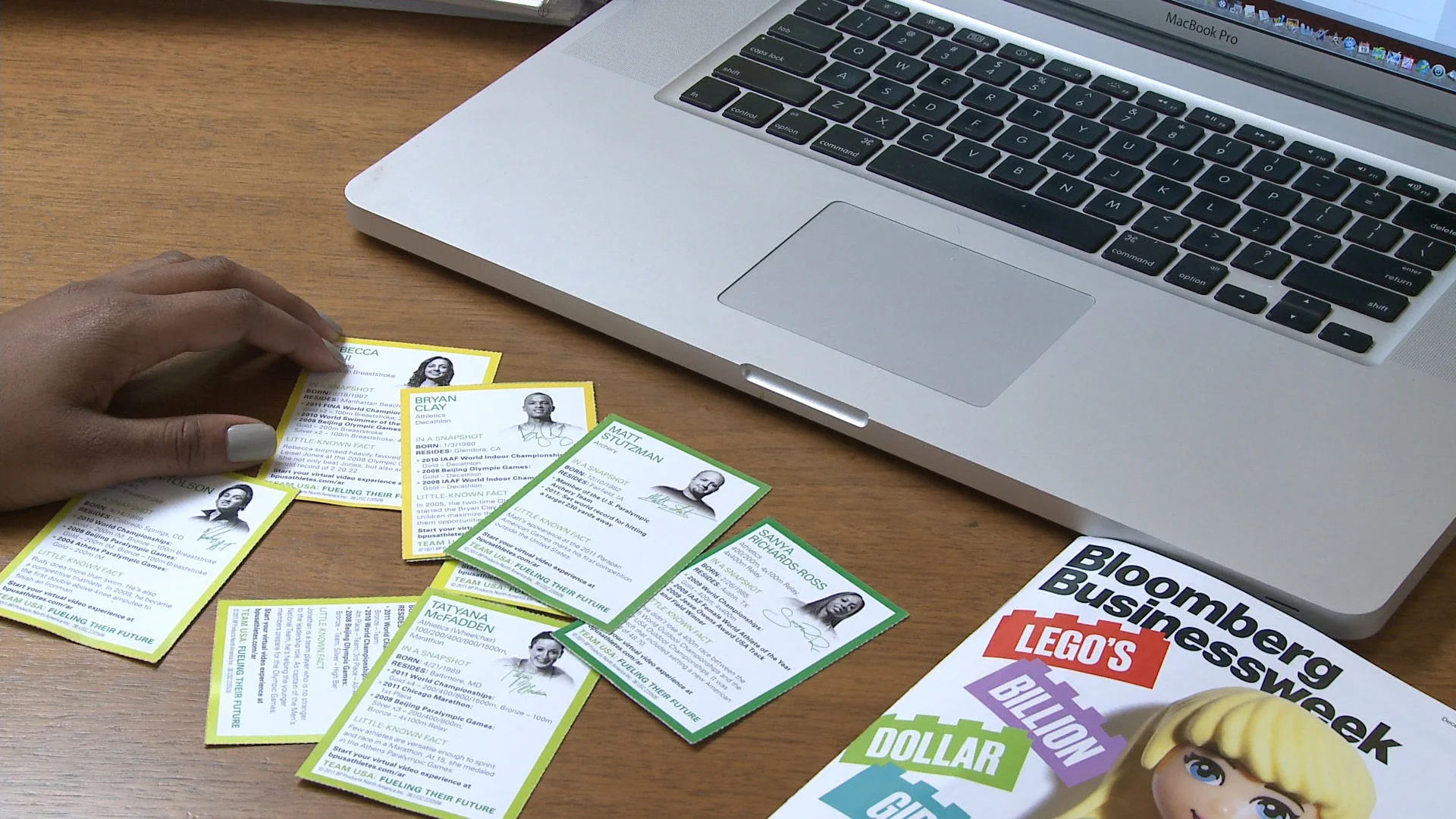
The campaign extended across social media drivers and interactive AR playing cards, each one unlocking an athlete's personal story when scanned. The core idea remained consistent throughout: let the athletes inform and inspire the audience, with BP positioned as a supporter of their journey rather than the center of the story.
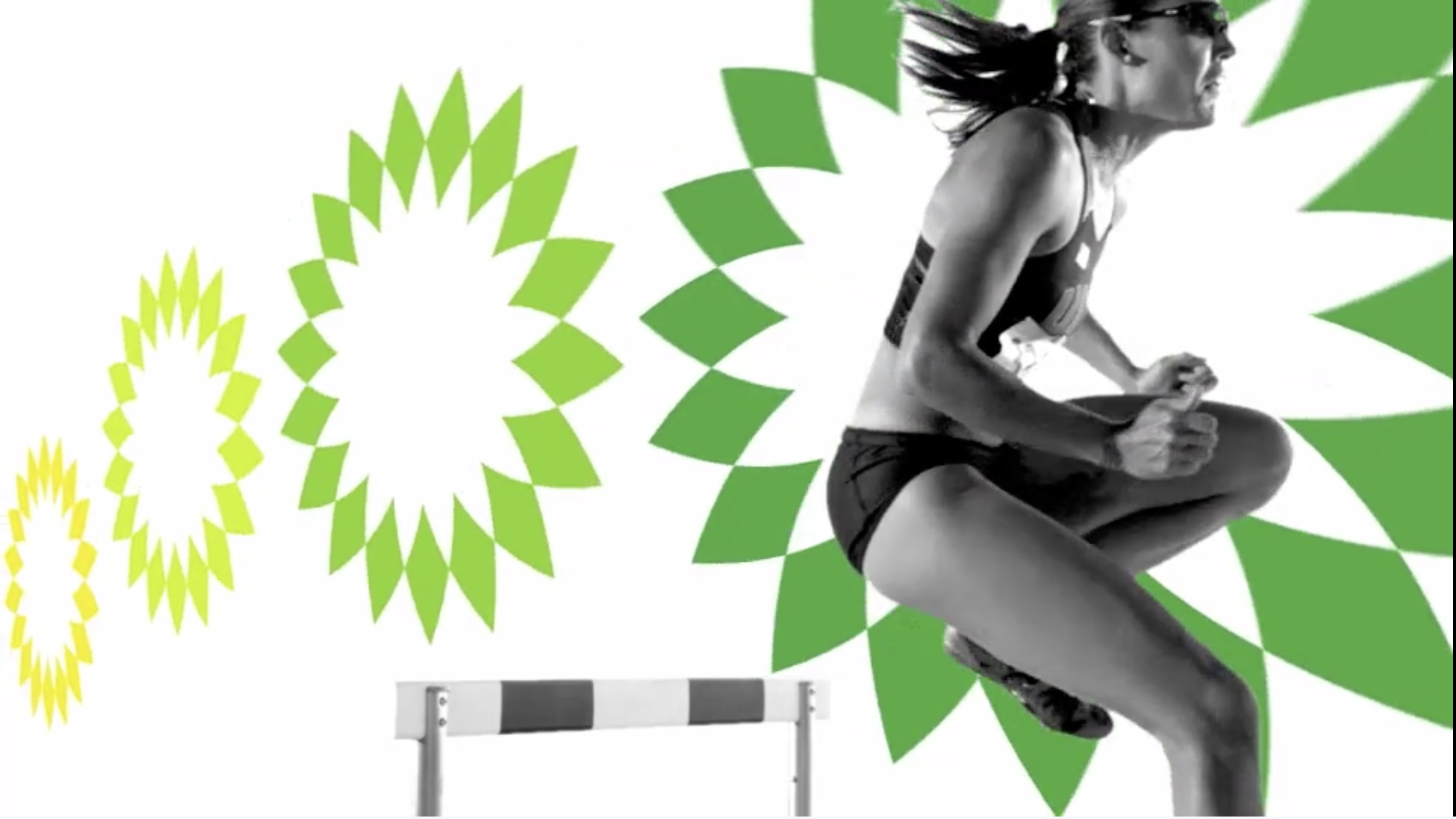
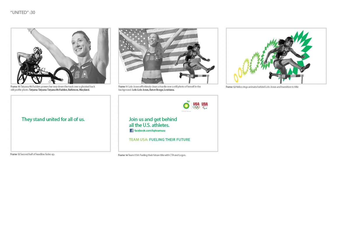
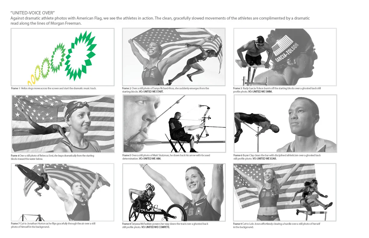
"United" — :30 broadcast spot storyboards featuring US Olympic and Paralympic athletes.
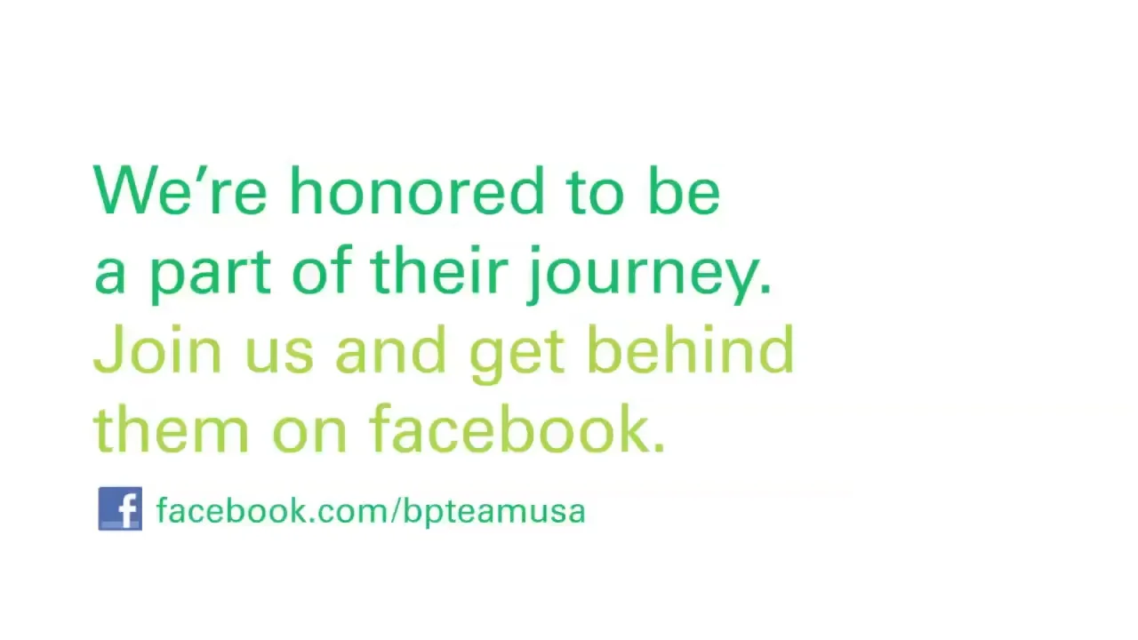
Campaign end card driving social engagement, and physical, AR-enabled athlete trading cards — scanning each card unlocked that athlete's personal story.
Despite the controversy surrounding BP at the time, the "United" campaign was successful in shifting public opinion — one study found that 38% of those aware of the sponsorship felt BP was working toward a cleaner planet. A central goal of the campaign was raising visibility of BP's relationship with the USOC; by the close of the Games, awareness of BP's sponsorship reached 23% among the target audience, well past the initial 15% goal and ahead of fellow USOC sponsors Citibank (14%), BMW (7%), and Dow Chemical (5%). BP also posted the second-largest increase in brand perception of any Olympic sponsor, moving from -5.9 to +2.6.
On Facebook, BP's following grew to over 300,000 fans, with post comments running 74% positive in support of the brand's commitment to US athletes during the Games. According to third-party analytics firm AlchemySocial, BP was among the most engaged brands on Facebook throughout the Olympics, generating the single most-engaged Olympic-related post of any brand — over 93,000 likes, 2,000 comments, and 1,300 shares. With BP committed to supporting Team USA through at least two more Olympic Games, the fan base built around the London campaign became a lasting foundation for continued engagement.
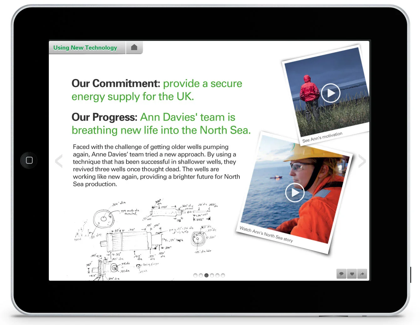
Alongside the Team USA campaign, our team designed an iPad experience built to help audiences understand BP's broader commitments to a cleaner energy future. Rather than a static list of corporate promises, the app organized BP's initiatives — including new technology, advanced fuels, stronger operations, and reduced carbon impact — into an explorable format centered on the people carrying that work forward.
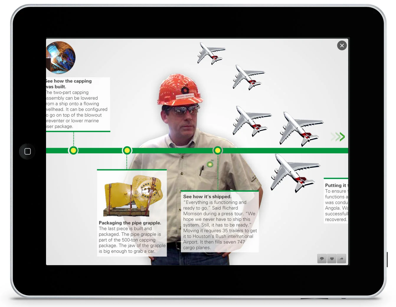
Each commitment paired a clear statement of intent with a real story of progress, using embedded video, photography, and interactive timelines to make complex technical and environmental work approachable. The goal was to move beyond messaging and give users a tangible sense of how BP was investing in technology and operational change in pursuit of a greener, more sustainable future.
BP Commitments iPad experience — connecting each corporate commitment to the people driving progress, with embedded video, rich media, and navigable chapter structure.
Digital experiences for Bank of America, spanning credit card marketing sites and in-branch interactive kiosk journeys.
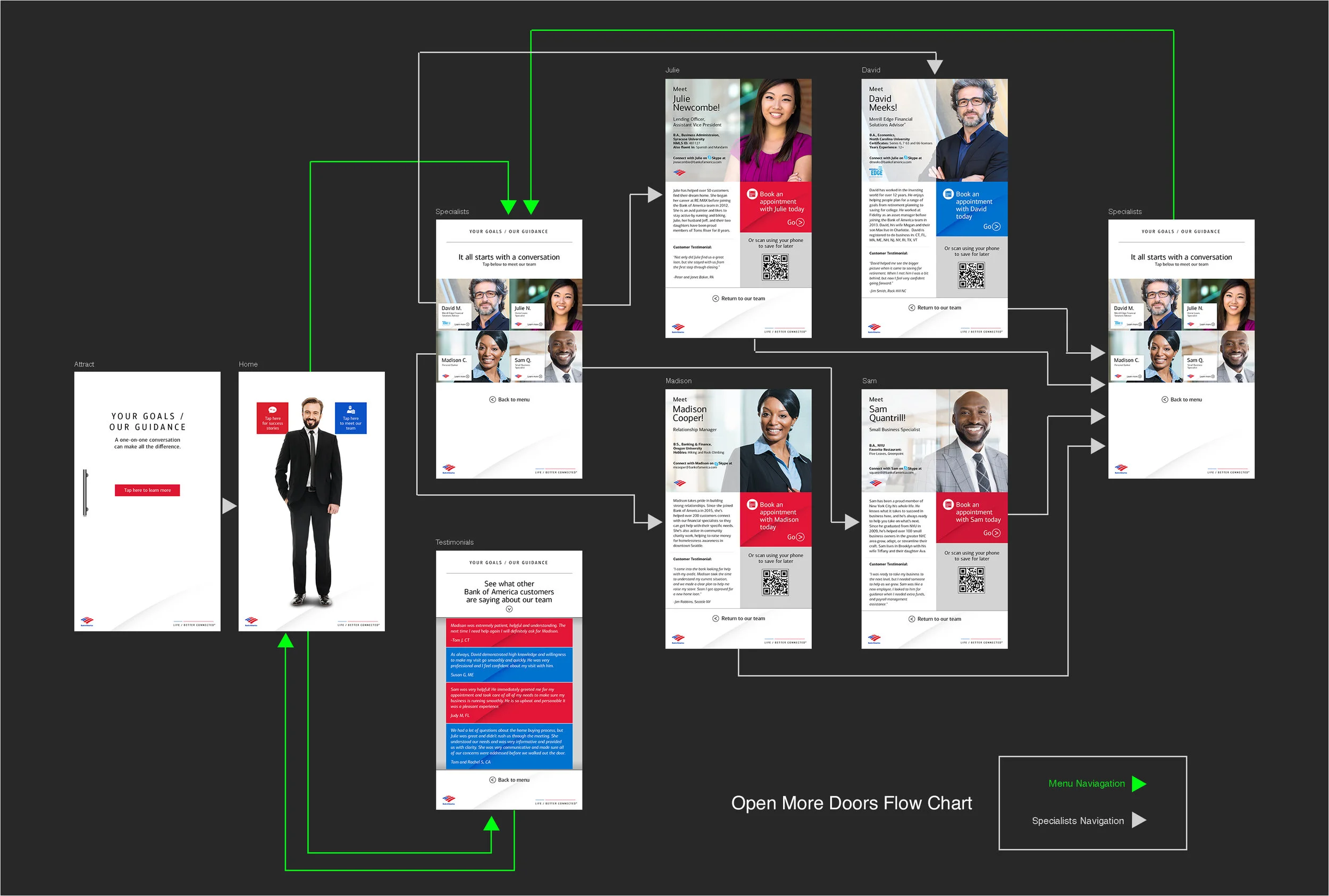
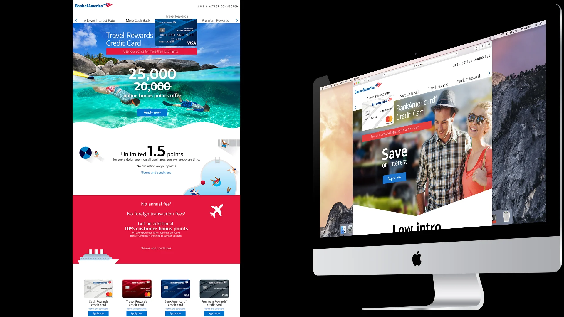
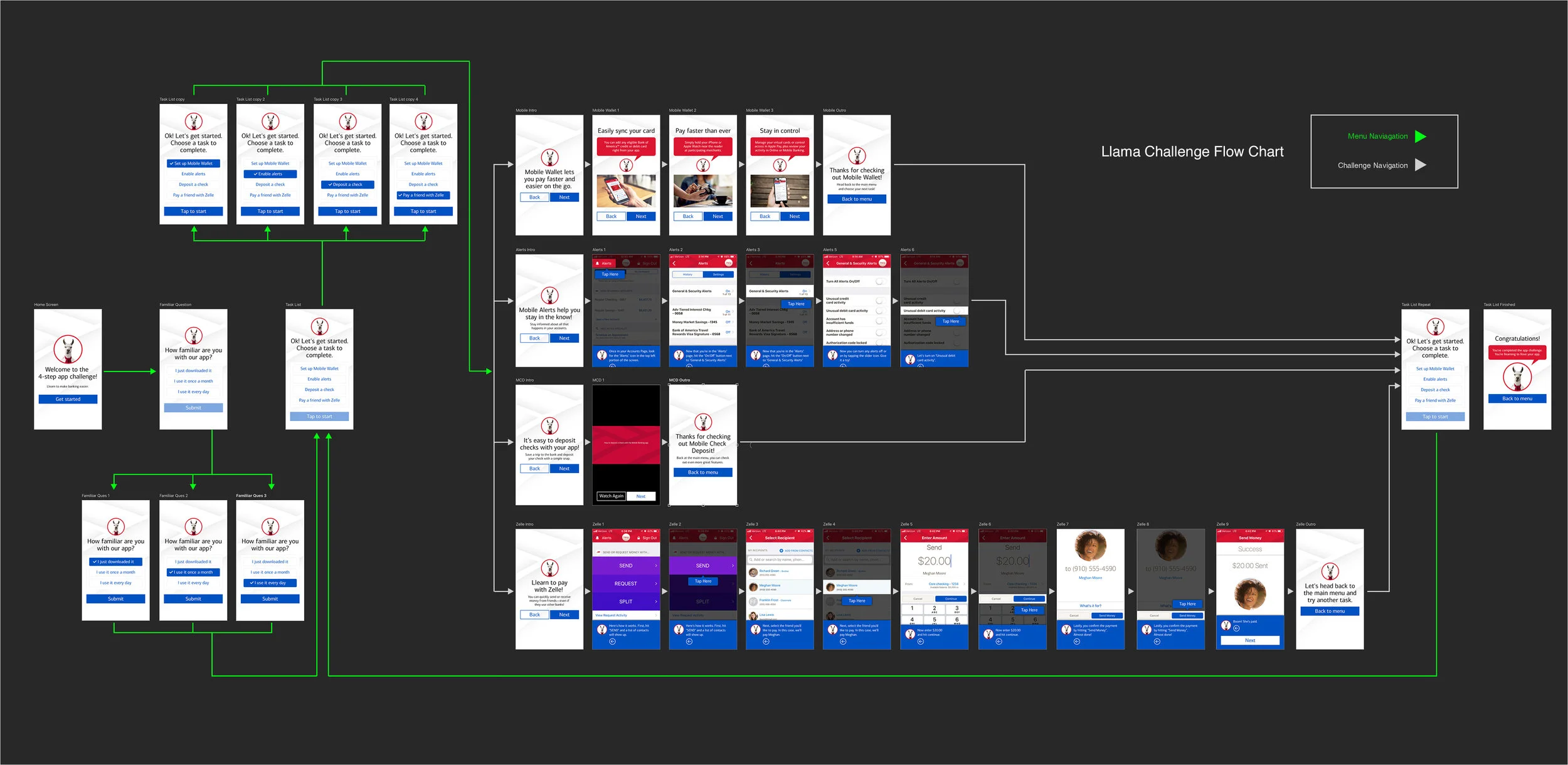
Work for Bank of America spanned both public-facing marketing and in-branch technology. The credit card site promoted the bank's Cash Rewards, Travel Rewards, BankAmericard, and Premium Rewards products with rotating seasonal offers, while the "Llama Challenge" and "Open More Doors" kiosk experiences lived inside physical branches — turning routine mobile-banking education and specialist introductions into guided, tap-through journeys for customers.
Bank of America credit card marketing site, featuring rotating offers across the Cash Rewards, Travel Rewards, BankAmericard, and Premium Rewards product lines.
"Llama Challenge" flow — a gamified in-branch experience teaching customers to use Mobile Wallet, Alerts, Mobile Check Deposit, and Zelle.
"Open More Doors" flow — an in-branch experience connecting customers with the right specialist, complete with team bios, testimonials, and appointment booking.
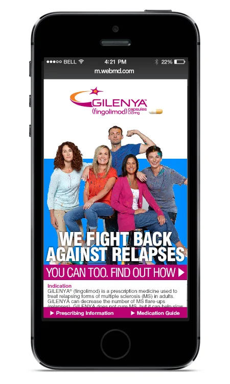
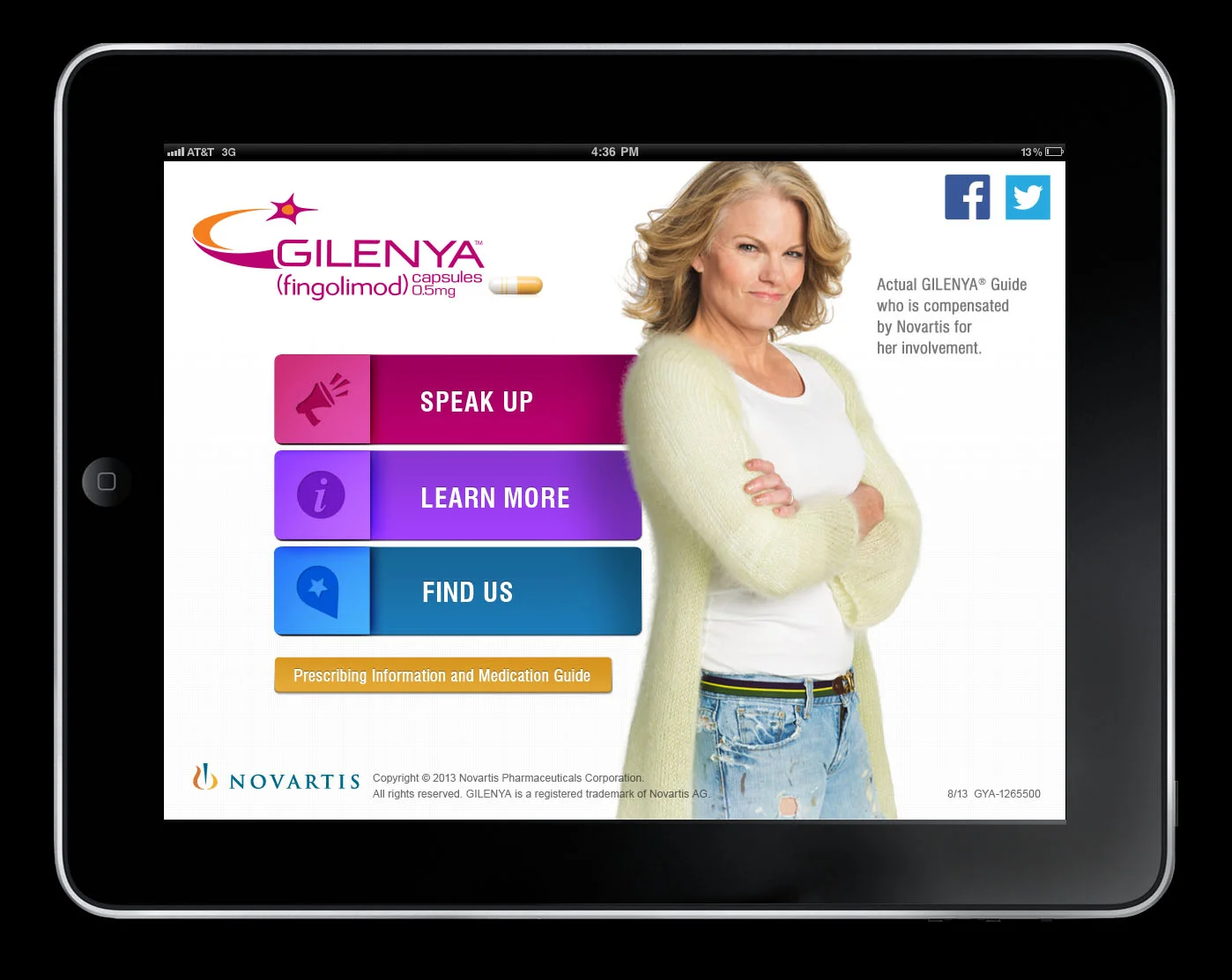
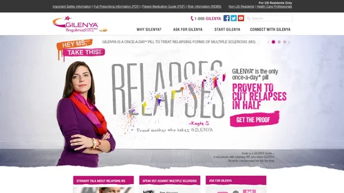
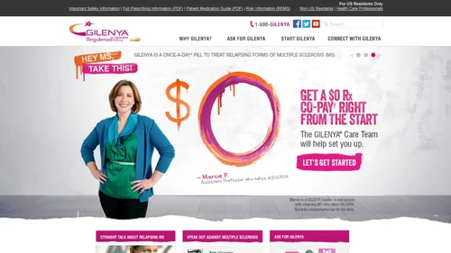
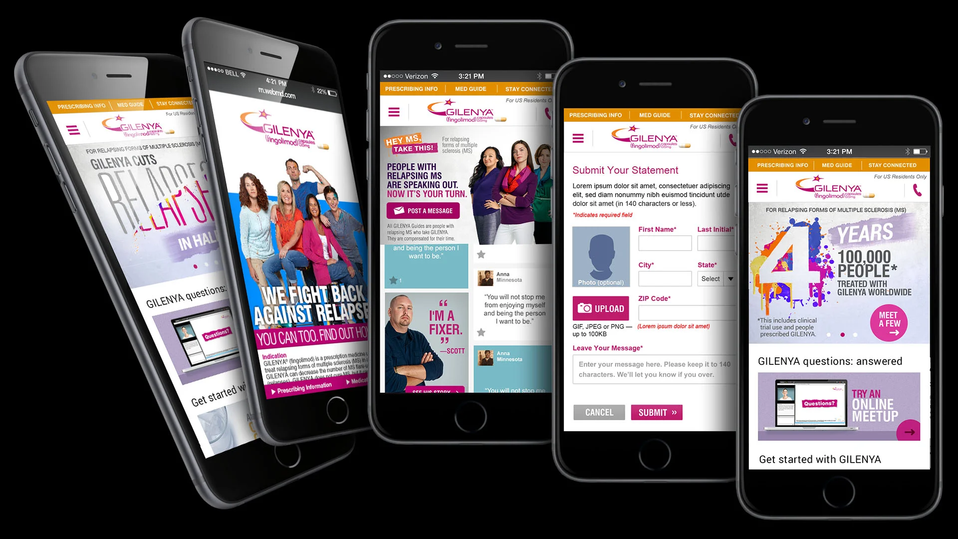
A multi-platform digital campaign for Novartis's Gilenya (fingolimod), spanning mobile web, a dedicated iPad app, and the brand's desktop website.
The Gilenya campaign centered on "Hey MS, Take This" — a bold, confrontational visual language that put patients' voices ahead of clinical messaging. The work spanned a mobile-first web experience built around a swipe interaction, a dedicated iPad app connecting patients with real Gilenya Guides, and a desktop site anchored by rotating proof points on reducing relapses.
Mobile web experience — a swipe interaction reveals the campaign's core message before transitioning to a patient-focused call to action.
Gilenya iPad app — connecting patients with real Gilenya Guides through Speak Up, Learn More, and Find Us pathways.
Gilenya.com — rotating homepage hero content and supporting mobile pages built to drive patients toward speaking with their doctor and enrolling in the Gilenya Care Team program.
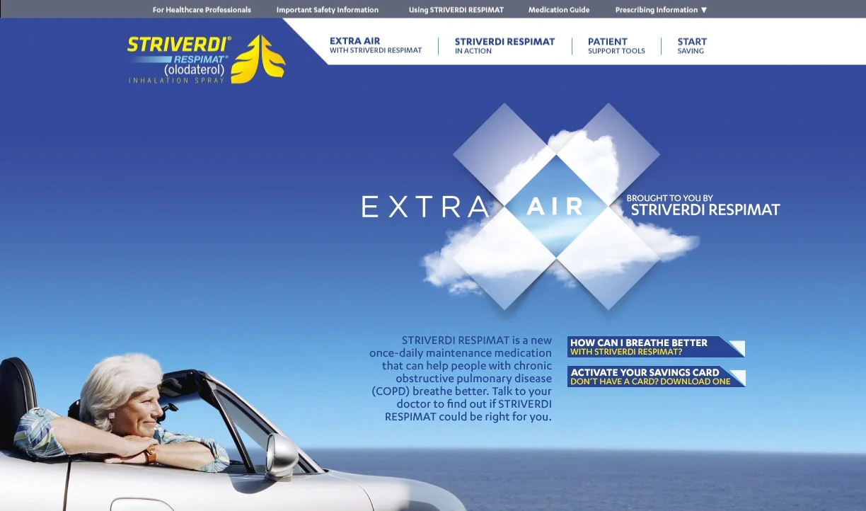
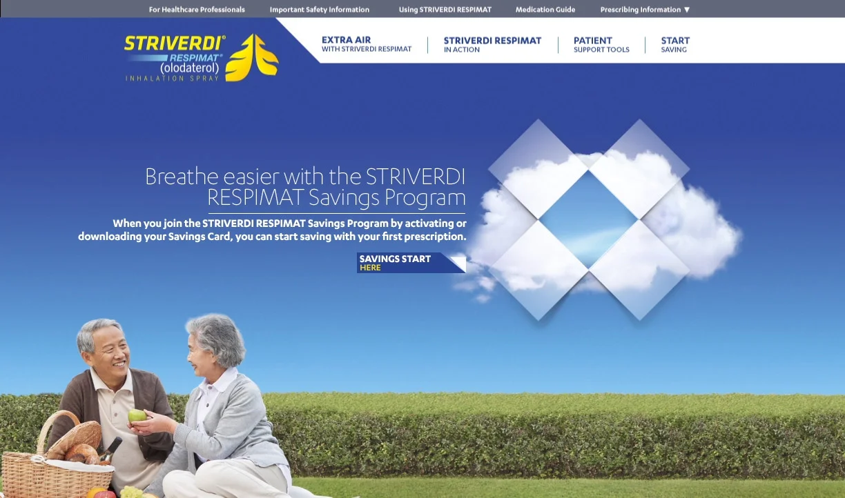
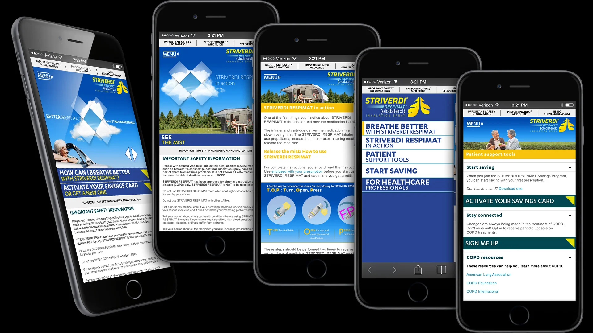
A digital campaign for Boehringer Ingelheim's Striverdi Respimat (olodaterol), spanning the brand website, display advertising, email, and mobile.
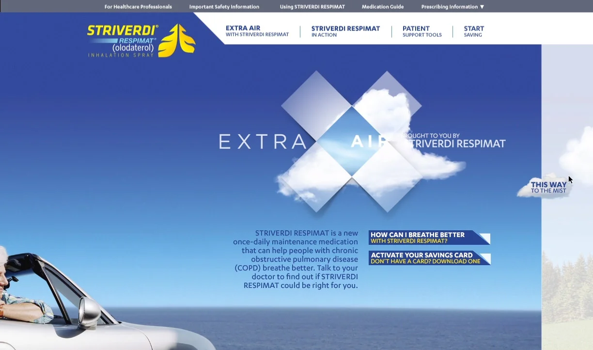
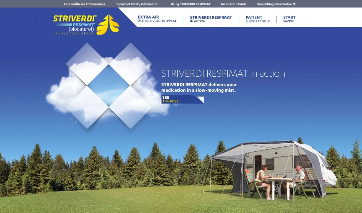
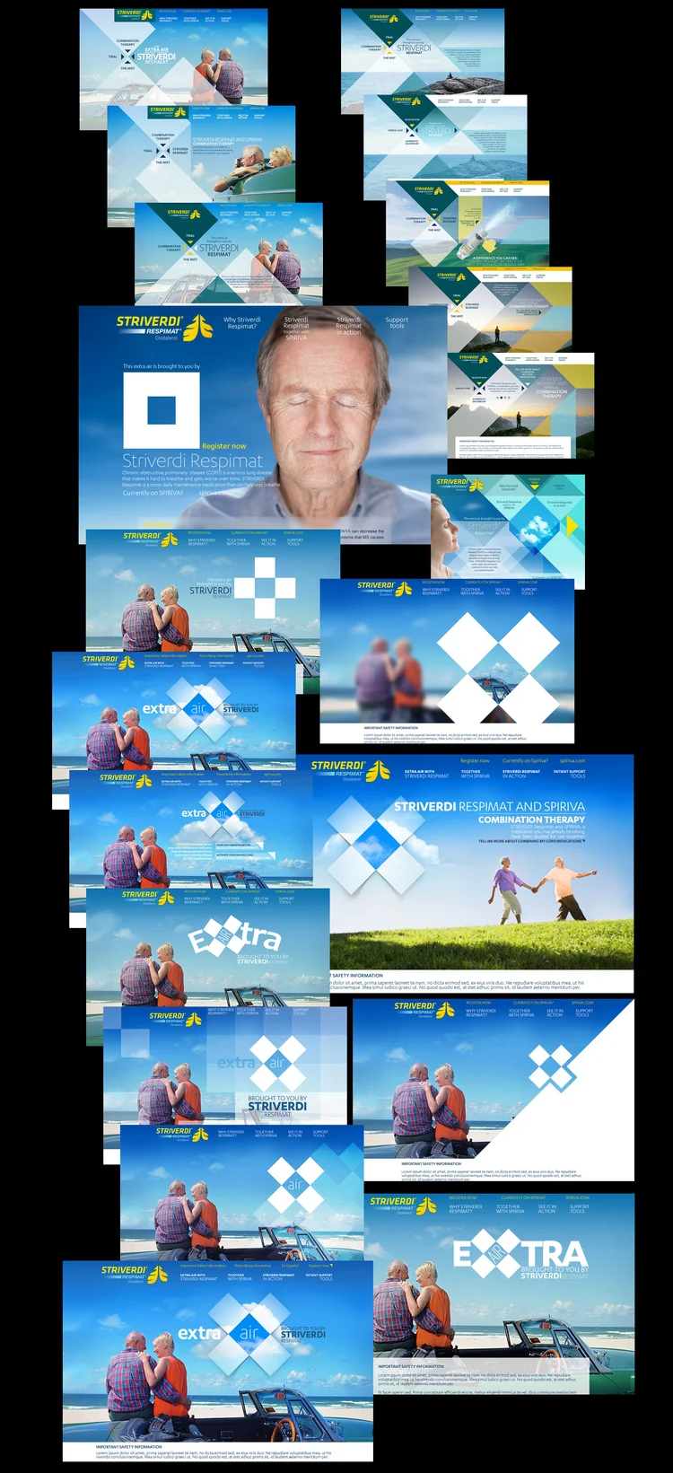
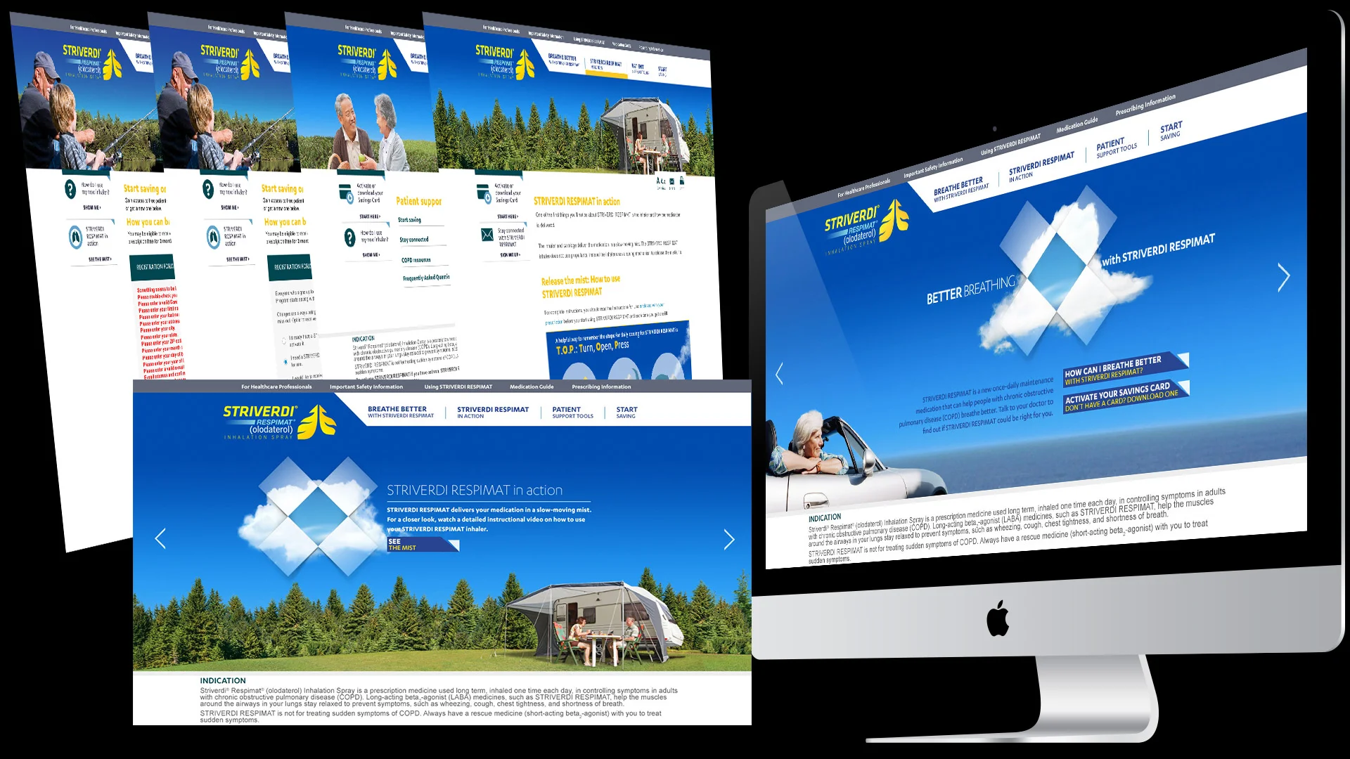
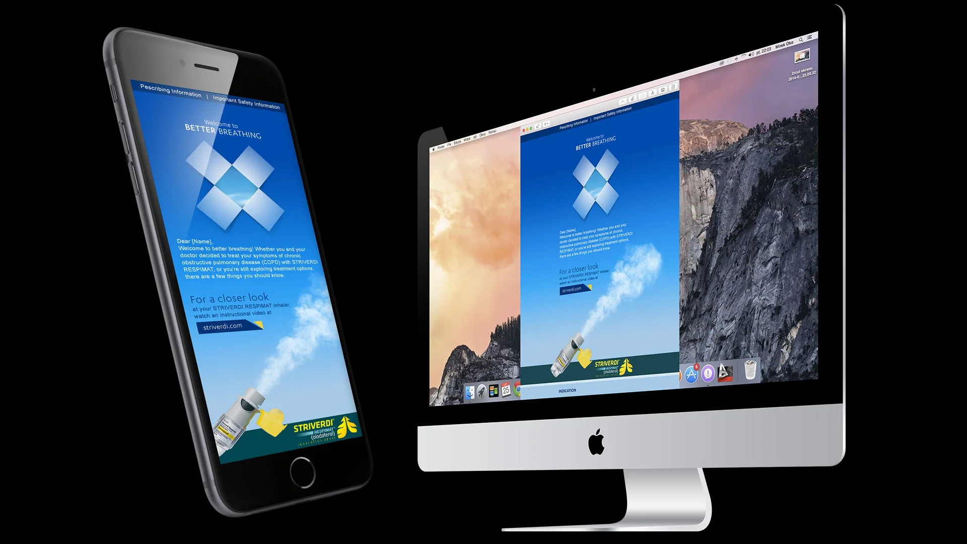
Striverdi Respimat's "Extra Air" campaign used a recurring diamond-and-cloud motif to visualize the relief the product offered COPD patients. That motif carried from an interactive homepage reveal through display advertising, patient onboarding email, and a fully responsive mobile site, giving the brand a consistent visual signature across every touchpoint.
Striverdi.com — the "Extra Air" homepage and supporting pages, using an interactive cloud reveal to introduce the product story.
A range of banner ad executions, including standalone Striverdi creative and Striverdi + Spiriva combination therapy messaging.
Homepage design exploration alongside the final "Better Breathing" desktop site.
"Welcome to Better Breathing" patient onboarding email, shown on mobile and desktop.
Mobile site experience — savings activation, product-in-action content, and patient support tools optimized for smaller screens.
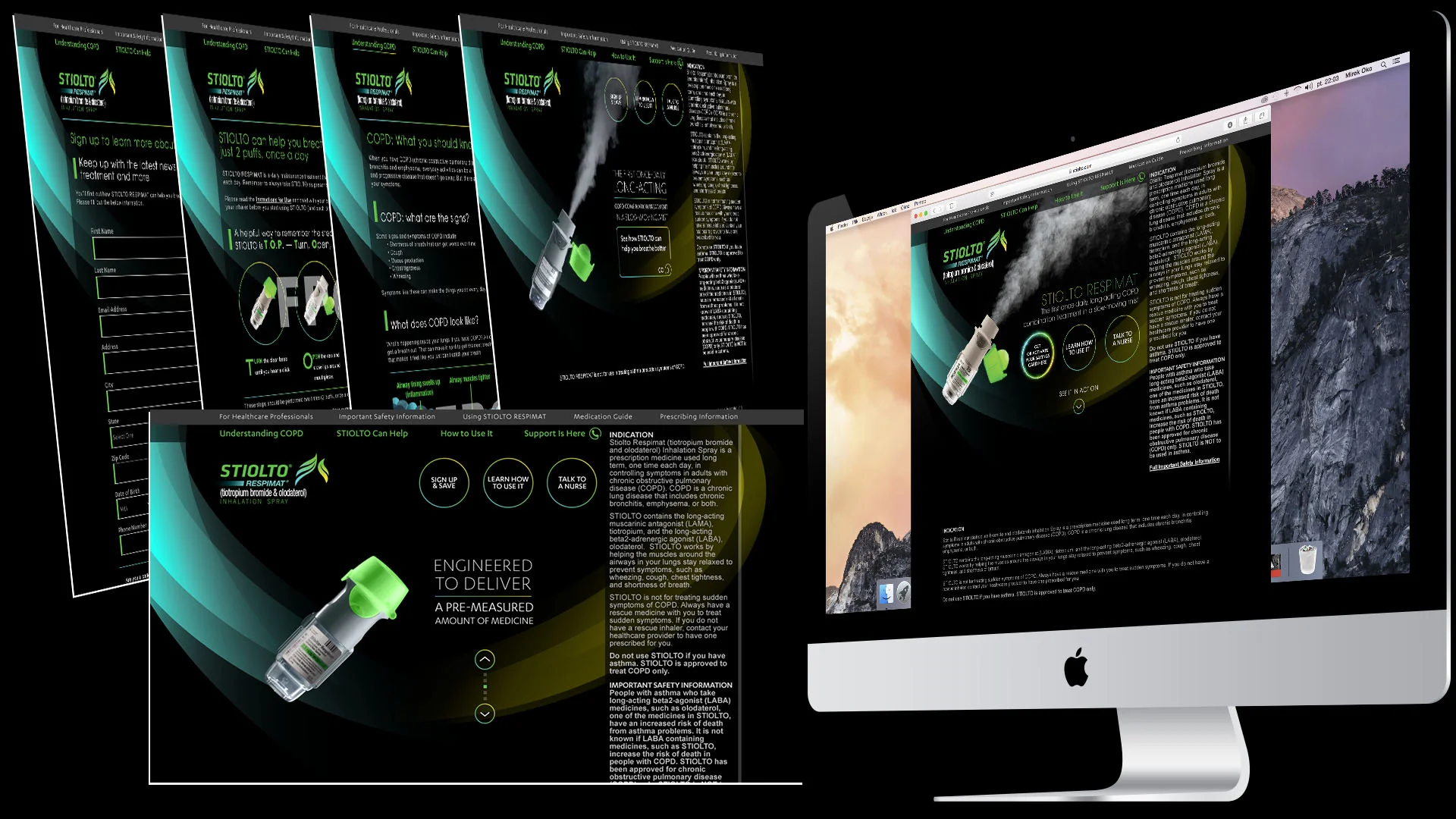
A digital campaign for Boehringer Ingelheim's Stiolto Respimat (tiotropium bromide and olodaterol), spanning the brand website, email, and mobile.
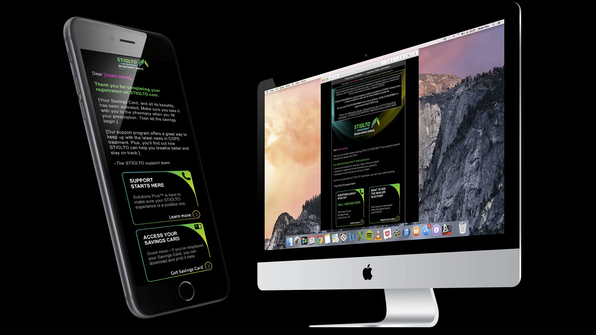
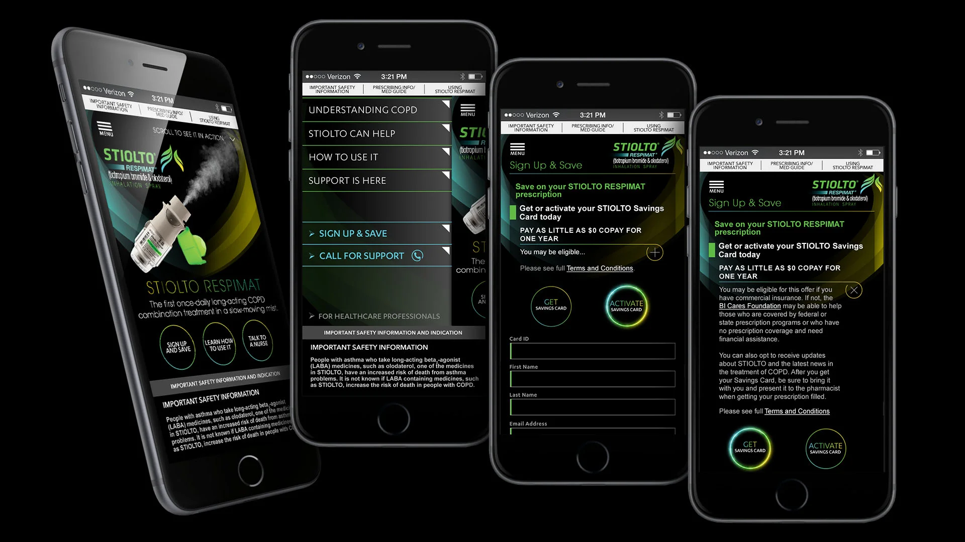
Stiolto Respimat's campaign guided COPD patients through a clear progression — understanding the condition, learning how the once-daily combination treatment works, and staying supported once they started. A dark, high-contrast visual system carried that journey across the website, a registration confirmation email, and a fully built-out mobile experience.
Stiolto.com — guiding patients through understanding COPD, how STIOLTO works, and how to use the inhaler.
Registration confirmation email, welcoming patients to the STIOLTO support program and Savings Card.
Mobile site experience — product education, navigation menu, and the Sign Up & Save flow.
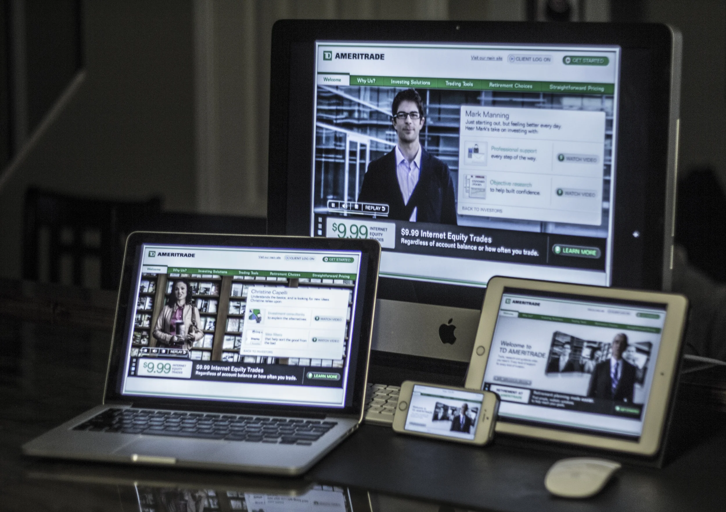
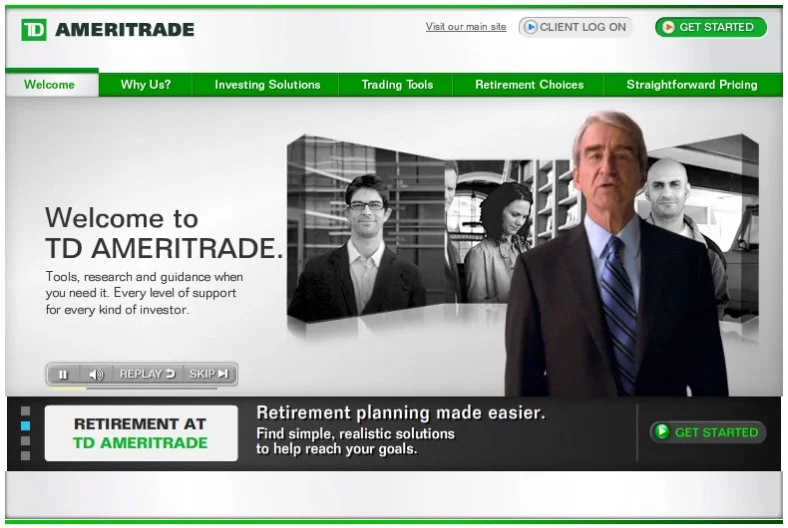
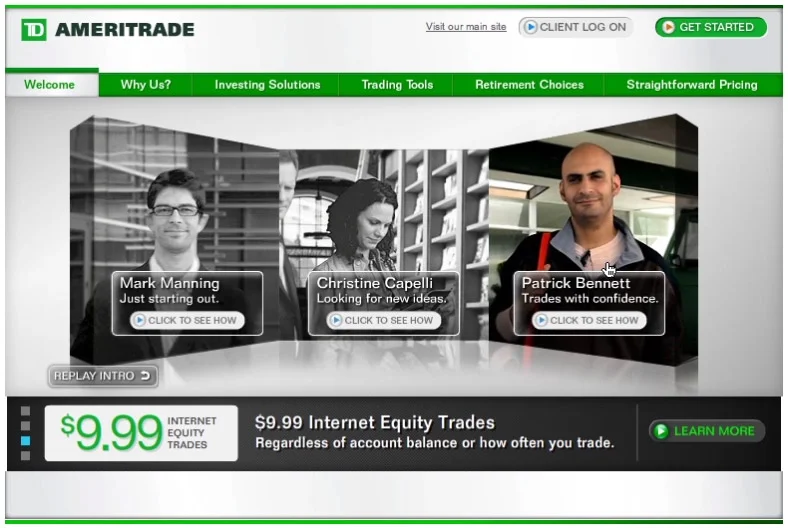
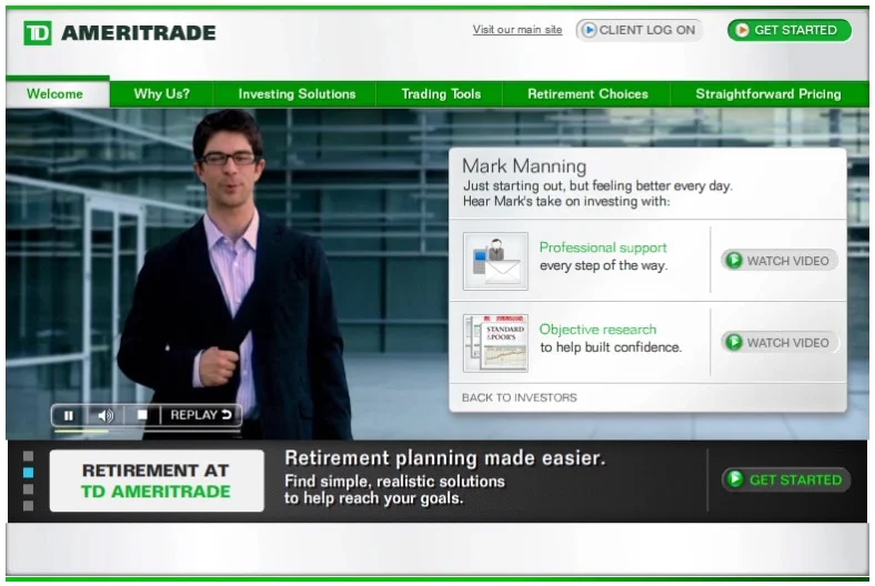
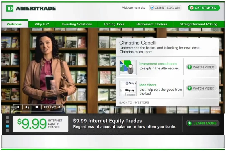
A digital campaign for TD Ameritrade, introducing new investors to the tools, research, and guidance available at every stage of their investing journey.
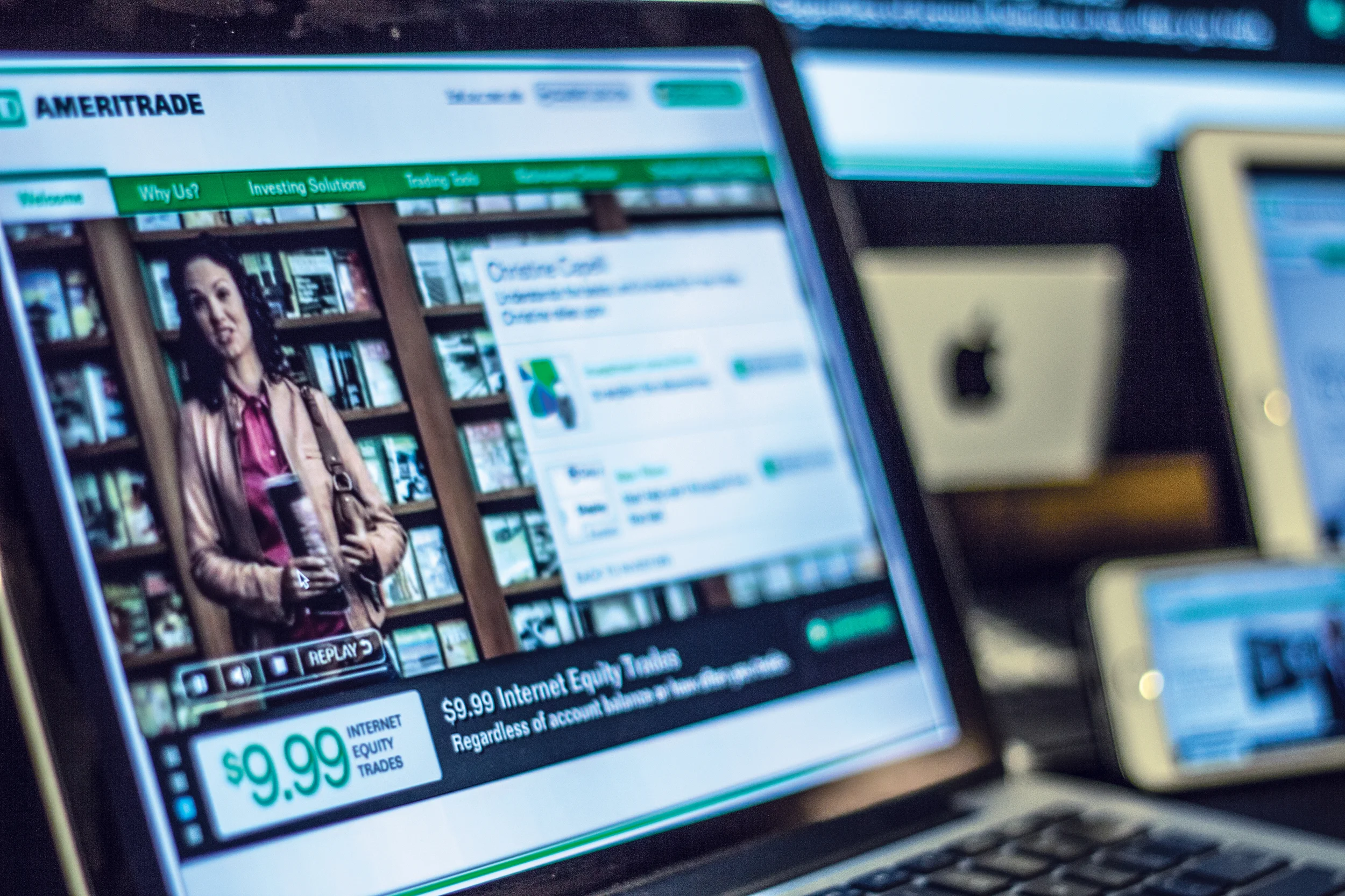
TD Ameritrade's "Welcome to TD Ameritrade" experience let new investors see themselves in the product by choosing one of three personas — Mark, just starting out; Christine, looking for new ideas; and Patrick, trading with confidence — each surfacing a tailored video and set of tools. The homepage video experience adapted fluidly across desktop, laptop, tablet, and phone.
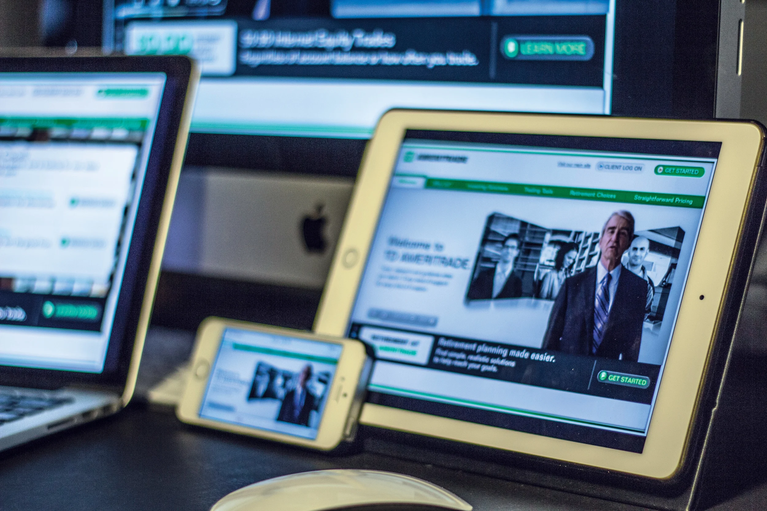
TD Ameritrade's investor welcome experience, shown across desktop, laptop, tablet, and mobile.
Homepage video experience — visitors select an investor persona (Mark, Christine, or Patrick) and see a tailored video with relevant tools and next steps.
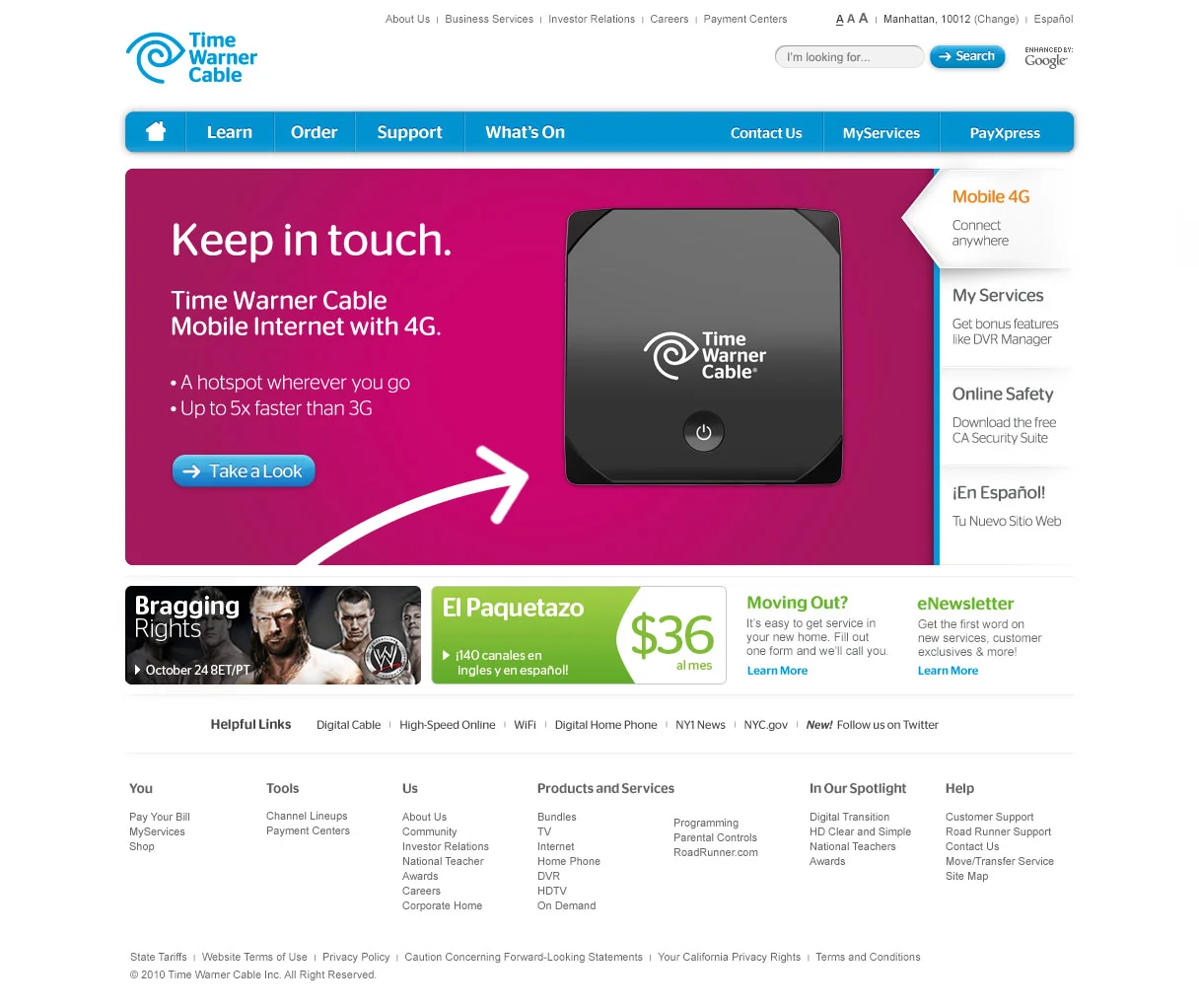
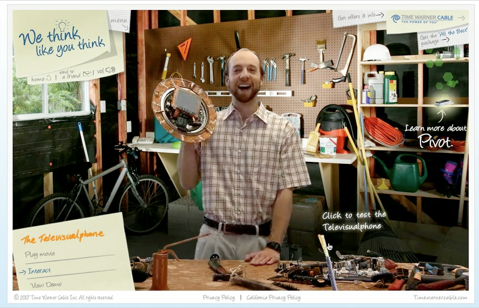
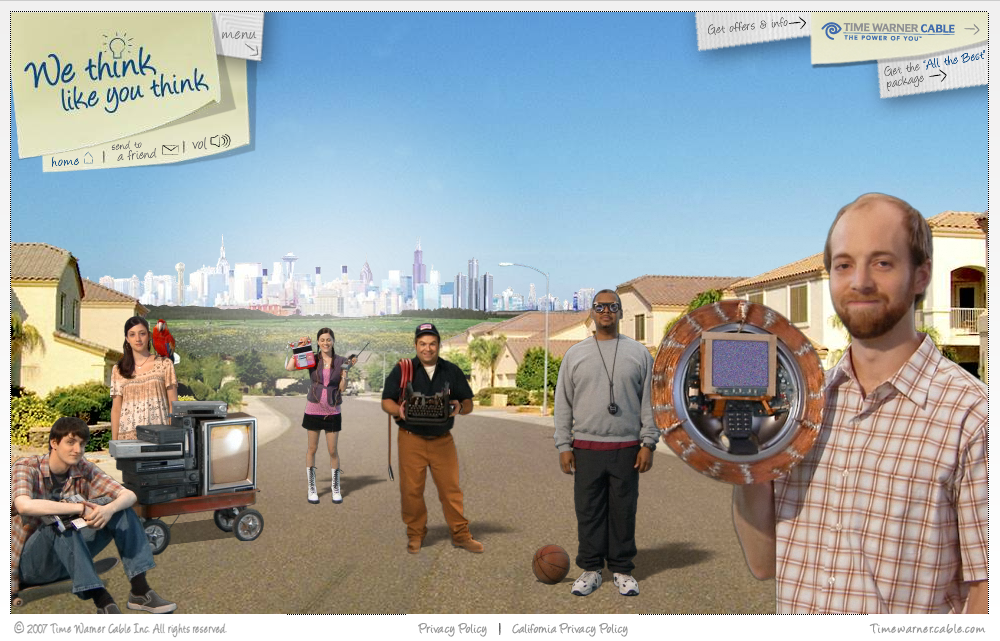
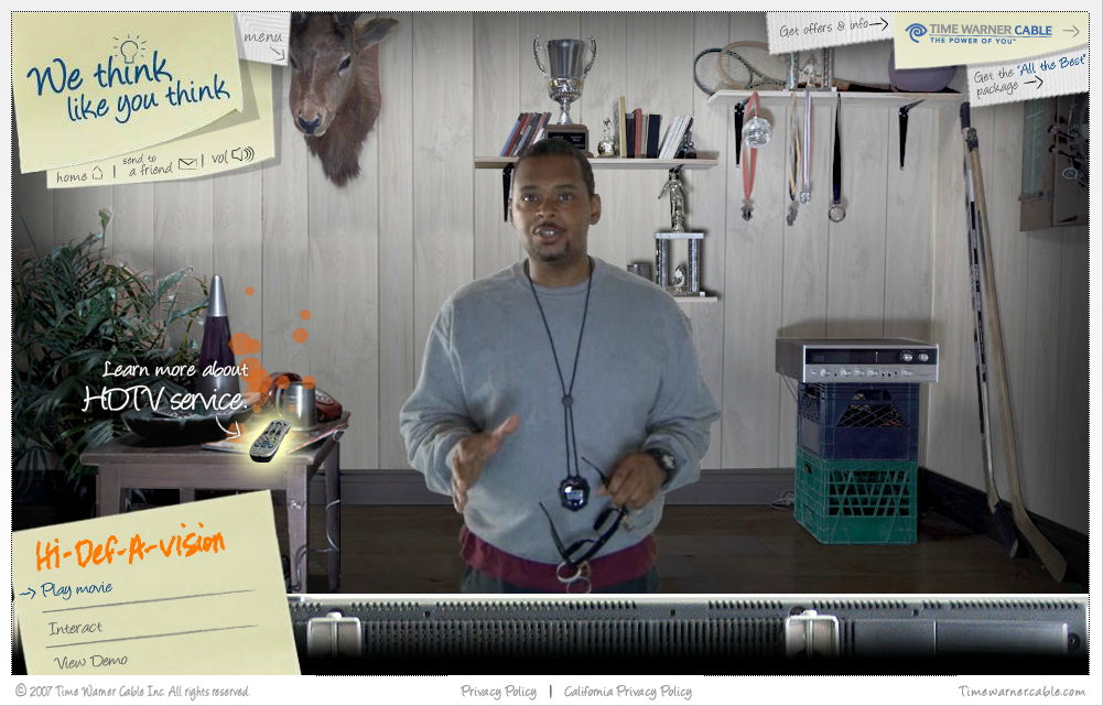
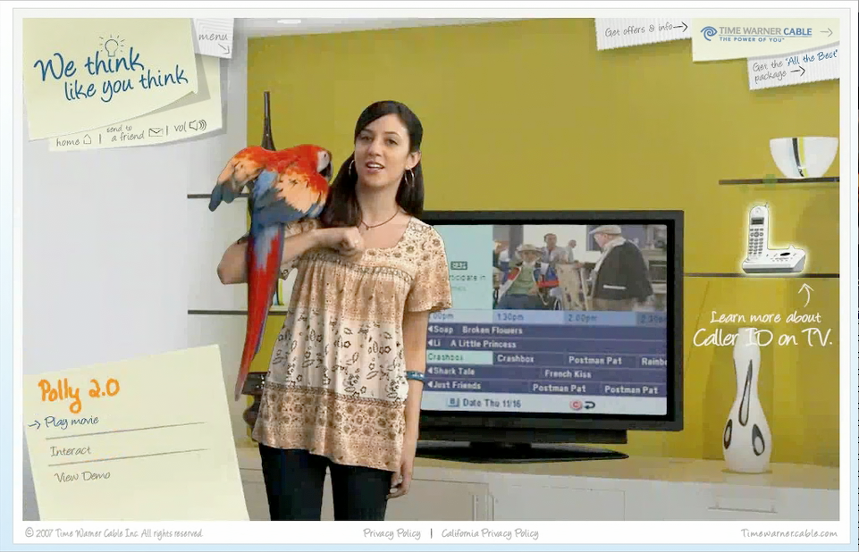
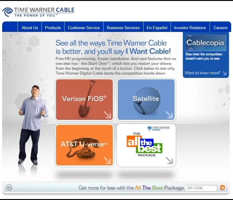
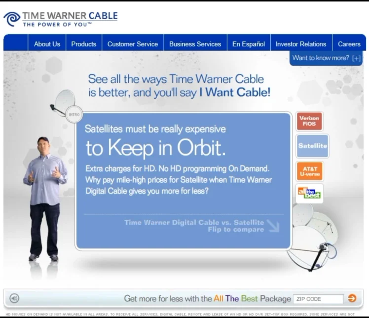
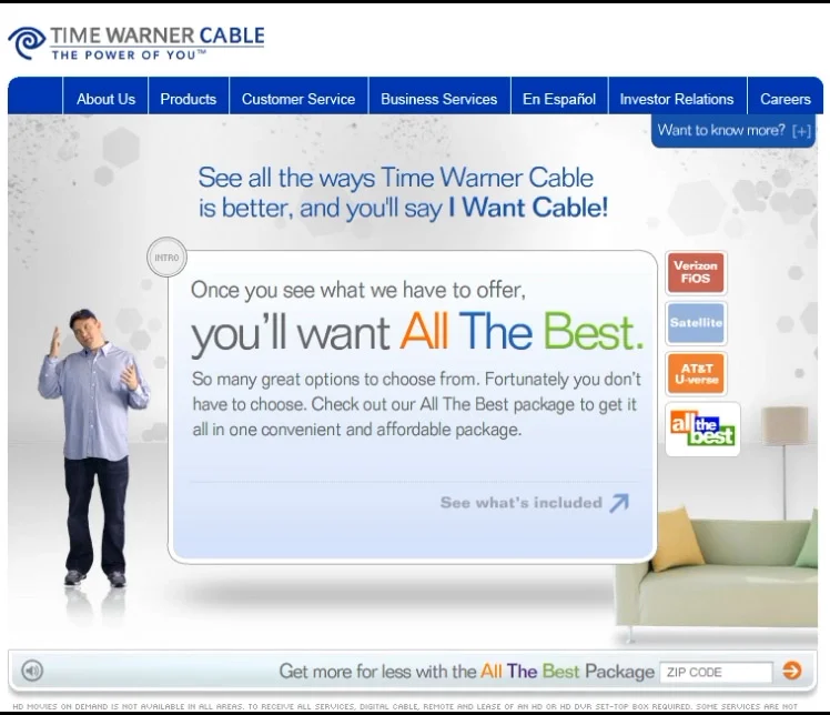
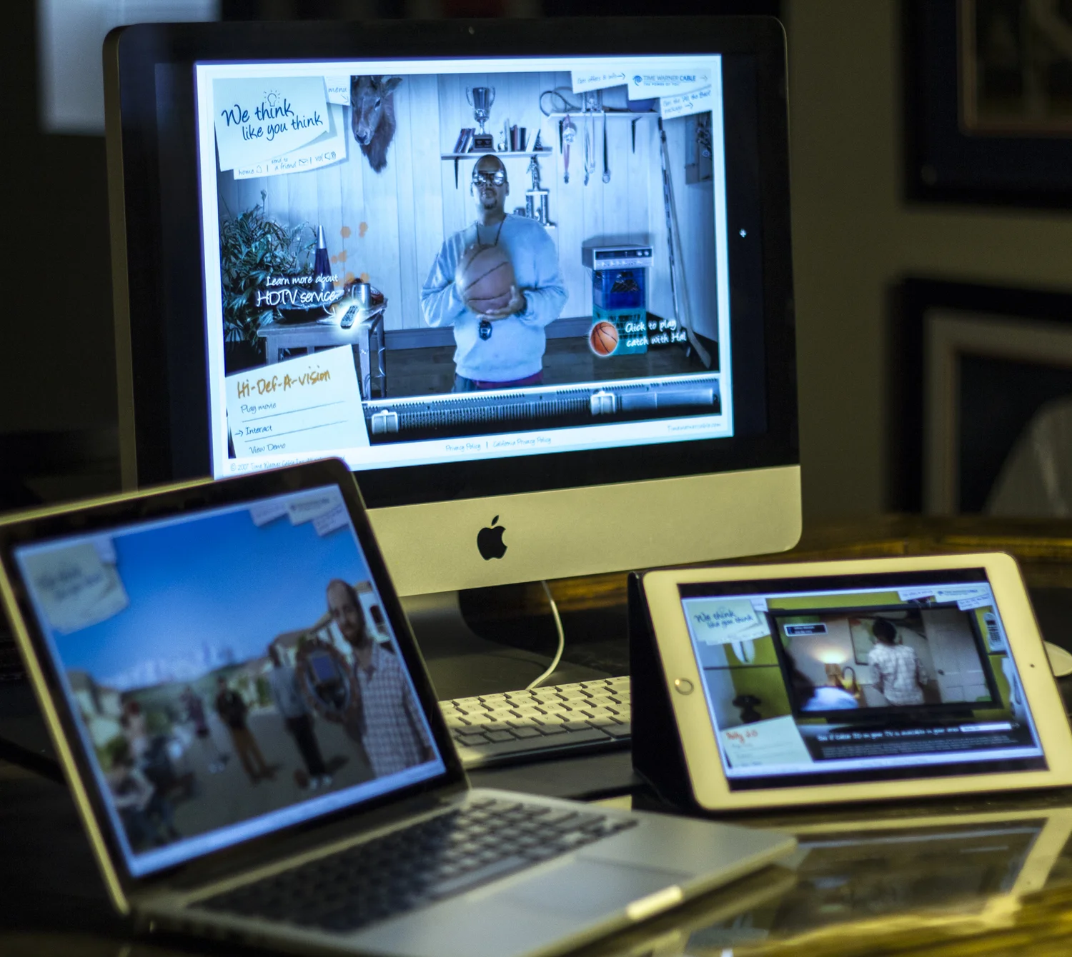
Digital work for Time Warner Cable, spanning the brand homepage, an interactive "We Think Like You Think" microsite, and a head-to-head competitive comparison experience.
Time Warner Cable's digital work ranged from brand marketing to product education. The homepage promoted Mobile Internet and bundle offers, the "We Think Like You Think" microsite personified product benefits through playful fictional inventions like the Televisualphone and Polly 2.0, and the "I Want Cable" comparison tool helped customers weigh Time Warner Cable directly against Verizon FiOS, satellite, and AT&T U-verse.
Time Warner Cable homepage, promoting Mobile Internet with 4G alongside programming and bundle offers.
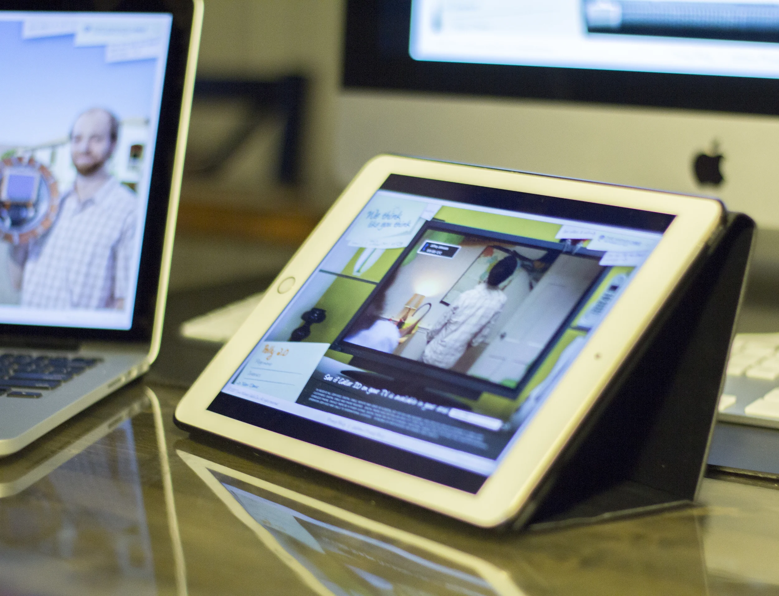
An interactive microsite personifying Time Warner Cable's product benefits through playful, fictional inventions — the Televisualphone, Polly 2.0, and Hi-Def-A-Vision.
"I Want Cable" — an interactive comparison tool letting customers weigh Time Warner Cable against Verizon FiOS, satellite, and AT&T U-verse side by side.
The "We Think Like You Think" experience shown across desktop, laptop, and tablet.
A collection of video content, motion design, and animation work produced across brand and agency projects.
This reel gathers video and motion design work produced across a range of brand and agency projects — from product animations and homepage hero videos to feature explainers, holographic brand pieces, and site-takeover ad units. Each piece is captioned below with the client and concept it was built for.
Striverdi.com Animation Prototype — An early motion prototype for Striverdi.com, testing the diamond-and-cloud reveal animation used to introduce the "Extra Air" homepage message before development.
TONY Flagship — A flagship brand animation combining motion graphics and typography to introduce a product story.
Consumer Ambient — An ambient brand video built for consumer-facing placements, with soft pacing and motion suited to background or waiting-area display.
Merrill Edge Orbit — Animated orbital motion graphics created for a Merrill Edge digital touchpoint, using rotating rings and particle motion to visualize guidance orbiting the client.
Bank of America Hologram — A holographic-style motion piece produced for Bank of America, using layered light and transparency effects to visualize digital banking concepts.
Bank of America Auto Online — A promotional animation for Bank of America's online auto financing tools, walking through the ease of applying for and managing an auto loan digitally.
BlackRock Voices — APAC Vignette — A vignette-style video for BlackRock's "Voices" campaign in the APAC region, framing investor and market commentary within short narrative segments.
TWC Signature Home — Vesta Preview — A preview reel for Time Warner Cable's connected smart-home platform (codenamed Vesta), showcasing its core features and interface.
Thomson Reuters — Tennis Intro — A tennis-themed intro animation for Thomson Reuters, using dynamic motion and sport-inspired transitions to open a branded video piece.
Thomson Reuters Accelus — A product explainer for Thomson Reuters Accelus, its governance, risk, and compliance platform, walking through the tool's core capabilities.
TWC 4G Hero Homepage Video — A short hero video for the Time Warner Cable homepage, promoting Mobile Internet with 4G as a fast, portable hotspot solution.
TWC DVR Manager & On Demand — A feature walkthrough of Time Warner Cable's DVR Manager and On Demand tools, showing how customers manage recordings and browse content from TV or mobile.
Gilenya 1.75 Animation — A product animation for Gilenya, visualizing how the once-daily capsule works within the body to help manage relapsing multiple sclerosis.
Mia 2 — A short character animation study, one of several quick motion pieces produced as part of a broader animation set.
Gilenya — Hey MS Homepage Animation — A homepage animation for Gilenya's "Hey MS, Take This" campaign, bringing the campaign's bold typography and color palette to life in motion.
GSK — One Step Site (Malaria) — A short animated preview of a "One Step" microsite built for GSK's malaria awareness and prevention initiative.
GSK — One Step Site Landing — A companion landing animation for the GSK One Step microsite, previewing the entry experience before visitors continue into the full site.
Teamwork — A brand video centered on teamwork and collaboration themes, finished in high-resolution ProRes for broadcast or presentation use.
Roundabout — An extended cut of a "Roundabout"-themed animation, using circular motion and looping transitions as its core visual device.
Main Animation — 30s Cut — A shortened cut of a primary campaign animation, condensed into a 30-second format for media placements.
Wicked — Site Takeover — A rich-media site takeover animation created to promote the Broadway musical Wicked, built as a full-page digital ad execution.
Gilenya 1.75 Animation (Early Cut) — An earlier version of the Gilenya product animation, visualizing how the once-daily capsule works to help manage relapsing MS.
Thomson Reuters Accelus (Early Cut) — An earlier cut of the Thomson Reuters Accelus explainer, introducing the platform's governance, risk, and compliance tools.
2011 Highlights Reel — A personal highlights reel compiling motion design and video work from 2011, spanning brand animation, UI motion, and video editing.
A collection of broadcast and digital content produced under creative direction across agency and brand projects.
This reel represents creative direction across broadcast spots, digital ads, new-business pitch reels, and agency creative pitches — spanning clients from Bank of America to Unilever. It reflects the range of formats and stages of production this work has touched, from concept pitch through finished, client-ready spots.
Bank of America — Store Promise for Small Business — A digital spot for Bank of America's small business banking, built around the brand's "Store Promise" messaging to reassure business owners of dependable, in-branch support.
Bank of America — Zelle Digital Spot — A horizontal digital ad promoting Zelle within Bank of America's mobile app, showing how customers can send and receive money quickly with people they trust.
New Business Pitch — WSOP — A new-business pitch reel built around World Series of Poker branding, demonstrating creative direction and concept development for a prospective client win.
Ogilvy / Unilever Pitch — Jack and Jill — A creative pitch reel produced at Ogilvy for Unilever's Jack and Jill children's oral care brand, presenting a concept direction for the client's consideration.
OWO — Rich Media Site Takeover — A short rich-media site takeover animation, built to run as a full-page digital ad execution.
The Great Courses — A promotional spot for The Great Courses, introducing the brand's lecture-based learning library to prospective subscribers.
FSE — Full Reel — An extended-length reel produced for FSE, running nearly five minutes and compiling a fuller body of creative work into a single piece.